Until this year, the health nonprofit Path hadn’t updated its website for a decade–not an uncommon lapse for a nonprofit. “There’s this legacy in the sector of this tension . . . when we’re making decisions about how we allocate dollars either to program services that can directly impact people, or to marketing and branding,” says Carla Sandine, the organization’s chief marketing and communications officer.
Like other nonprofits, Path kept choosing to invest in its work to directly change public health. But it eventually realized that branding also deserved significant investment. The organization was telling some individual stories about its work, such as developing the first malaria vaccine, or a device that can transform table salt to purify water, a sexual health community for Vietnam on Facebook, or a partnership with tech companies to help health workers in Zambia access data as they aim to eliminate malaria. But it was struggling to tell a unified story about its projects, and its website was confusing and difficult to navigate.

“We just heard from people repeatedly that they didn’t understand who we were,” says Sandine. “Even our employees and our donors had a really hard time telling people who Path was, and telling people our story.” The nonprofit was likely losing out on donations; studies have found that the majority of donors give to the most well-known nonprofits. Potential partners might have also been more likely to think of other nonprofits first.
The organization chose to work with a brand design firm and an interactive agency who typically worked with businesses rather than nonprofits, and who recognized some of the problems in traditional nonprofit marketing.

“Nonprofits traditionally are not known for innovative or very contemporary brand design or communications,” says Tom Crabtree, founder and creative director of Manual, the brand design agency, which is known for its work with Nike and Gap. “We’ve seen that shift over the last few years with some more kind of consumer brand approaches, with Product Red or with Charity:water. But the majority of NGOs have been stuck in this world that we all know really well, which is the image of a Western organization swooping in to raise money for people in need–this “them” kind of thing–and Path wasn’t about that.”
The rebranding had to incorporate the fact that Path, though originally a U.S.-based team, had grown to have 1,600 employees working in 70 countries, with almost all employees coming from the countries where they work. Even describing itself as a “global health” organization no longer made sense.
“That phrase means something very different to someone sitting in Seattle versus someone sitting in Delhi,” says Sandine. “If I am in Delhi and I am leading our program in Delhi, they’re not global health issues. They’re public health issues. So we’ve really rethought a lot of the language that we used to be more culturally competent, more appropriate, more reflective of who we actually are as an organization.” (They now say that they’re a “global team of innovators working to increase health equity.”)

The website also had to be accessible and useful to anyone anywhere. Instrument, the interactive agency on the project, saw that a large portion of the traffic to the site was coming from a browser typically used on flip phones. Ministers of health in Vietnam or Zambia needed to be able to use the site as easily as a potential donor in the United States. “We want to think of this as being a beautiful and elegant experience,” says Steph Lanning, an executive producer at Instrument. “Not just if you’re on an iPhone 10, but if you’re on a flip phone, and so how do we not just make it work on that device, but how do we make it beautiful? How do we make it usable? How do we really think about every single user?”
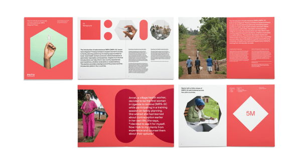
The brand’s new guidelines for photography take into account that the photographer might be working in a rural village without complicated equipment; the organization also decided that it would hire local photographers rather than the traditional nonprofit approach of sending a photographer from the U.S. or Europe. This mirrors the organization’s work in health–a team from Tanzania, for example, is working with the government there to lead a national digital health transformation, rather than an American team leading that work.

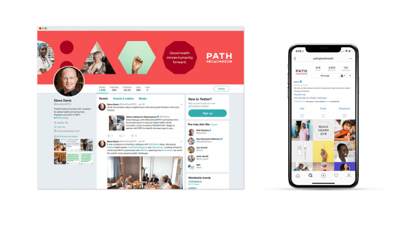
The brand’s new look is clean, with a website that focuses first on the larger story of the nonprofit and then makes it simple to navigate through specific examples of the organization’s work. The brand identity is designed to support telling those stories.
It was difficult to get the funding for the work, Sandine says, though the organization’s CEO supported it. Like other nonprofits, the majority of Path’s funding came from institutional funders who earmarked it for specific programs. The organization spent years planning for the rebrand with funding from individual donors, believing it was work that was critical for the nonprofit’s success. “We know that donors today give mainly to organizations that have really strong brand awareness, and we didn’t have that,” she says, adding, “We have to earn the trust of the people who are deciding to partner with us or invest in us. So I think it’s critical. Investment in a brand in a nonprofit that then can potentially pay off in building greater partnerships and increasing revenue then increases the impact we can have on the programmatic side of the work. It’s not a zero-sum game.”
Fast Company , Read Full Story
(29)