NYC COVID hot spots: Are you in a red zone? This real-time map will show you
New York City was the epicenter of the U.S. coronavirus crisis during the early days of the pandemic, and while debates about how quickly it will bounce back rage on, the new emergence of local hotspots over the past few weeks has sparked growing concerns among public health officials.
To help monitor signs of a second wave, spatial analytics firm Esri recently worked with the city’s Department of Information Technology and Telecommunications (DoITT) to create an interactive map and app called “find your zone,” which lets people search for COVID-19 outbreaks down to your address.
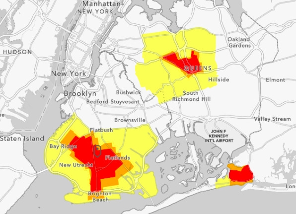
Clicking an area of the color-coded map within the five boroughs will tell you which of the state’s designated COVID zones are currently in effect for that area.
These designations actually matter because they determine which safety restrictions are expected to be followed, and in New York City right now, those can change from block to block. In red zones, for instance, schools are closed, mass gatherings are prohibited, and only essential businesses can operate. Yellow zones allow mass gatherings of up to 25 people and businesses can stay open if they follow certain guidelines.
The COVID-19 Zone Finder map is is especially useful because it lets you see each of these specific restrictions with a simple click.

As of this week, the map shows three distinct clusters in the city—one in Brooklyn and two in Queens. The statewide positivity rate remains low at just 1.09%, officials said (October 20, 2020), but the positivity rate in some of the red zones is closer to 5%. The good news is, the rate has been dropping in those zones thanks in part to close monitoring. Let’s hope that trend continues.
(107)


