One of the world’s biggest sports brands didn’t have a logo . . . until now
One of the world’s biggest sports brands didn’t have a logo . . . until now
The French sports brand, Decathlon, went 48 years without a logo.
Decathlon, the French sporting goods retailer, went 48 years without a logo. Now with help from the brand consultancy agency Wolff Olins, it finally has one.
Meet L’Orbit.
Founded in 1976, Decathlon has more than 1,700 stores in 72 countries and sells equipment for 85 sports. But until this year, the retailer was known only by its simple sans-serif wordmark.
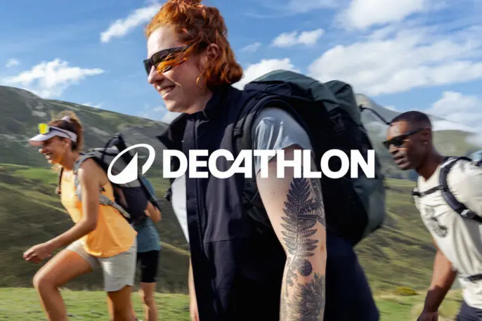
“At a practical level, Decathlon needed a logo that would fit across all its products, big and small,” says Emma Barratt, Wolff Olins’ global executive creative director. “But more importantly, one that marked its position as a global sports brand and also allowed its employees to feel proud.”
In other words, they were looking for a mark that was more Nike or Adidas than Dick’s Sporting Goods or Foot Locker. A tall order.
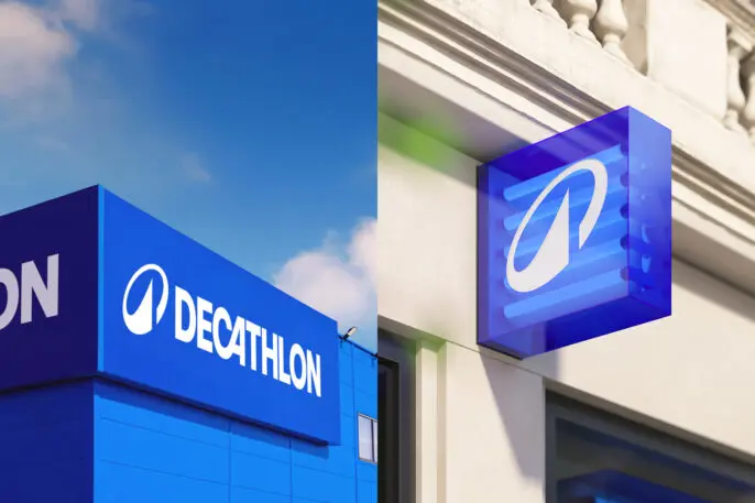
Its new ellipse-shaped logo was inspired by the wordmark’s connected CA ligature. The overall ambition for the new logo came from Decathlon’s global CEO, Wolff Olins’ global executive creative director Emma Barratt tells Fast Company.
The logo’s round shape “represents Decathlon’s passion and commitment to circularity,” she says, while the peak, which resembles a mountain or wave, was deliberately left open to interpretation.
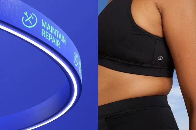
A new bespoke typeface, Decathlon Sans, was designed by Grilli Type, and Wolff Olins says it also worked to integrate elements of the new visual identity into product features and services that emphasize innovation and sustainability. Communications around the company’s maintain and repair programs, for example, use an ellipse shape to house hammer and wrench icons.
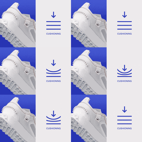
The new L’Orbit mark will appear on all products, which could do a lot to improve the retailer’s brand awareness. Decathlon has previously sold products in its portfolio of 85 labels under names like Quechua for camping and hiking and Allsix for volleyball. Now, they could feature L’Orbit where a swoosh or trefoil might otherwise appear on other brands’ products.
“It’s a symbol of joy and playfulness as well as excellence,” says Barratt. “But most importantly: It’s an invitation to move.”
Explore Topics
(6)


