Pentagram’s latest logo is designed to be listened to
How do you create a visual identity for a brand that’s focused on sound?
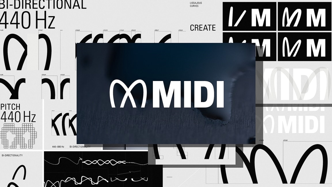
That was the central challenge Pentagram partners Yuri Suzuki and Sascha Lobe faced designing a new logo for the digital music protocol MIDI. MIDI is a universal standard that ensures musical instruments, like keyboards and synthesizers, can talk to each other, regardless of the manufacturer. The designers’ solution? Two logos—an M-shaped wordmark, which can be animated, and a sonic logo that together capture the breadth of MIDI’s capabilities.
![]()
This is MIDI’s first rebrand since the standard launched in the ’80s with an equally ’80s-style, blocky all-caps logo, and it marks the launch of an updated standard called MIDI 2.0.
![]()
The wordmark is the workhorse of the new identity, with some poetic touches. The smooth curves of the “M” are inspired by musical forms, including the Stuttgart pitch, which musicians commonly use to tune their instruments. It’s a tuning standard for the musical note A above middle C, and visually, it looks like the mathematically smooth apexes of a sine wave at 440 Hz. It’s also inspired by Lissajous Curves, which visualize the parametric equations that depict harmonic motion.
The “M” mark also acts as a pictogram. When it appears on hardware, it’s to indicate a function, not a brand. It’s more similar to, say, a Bluetooth symbol or Intel chip. “No one buys MIDI,” says Lobe. “You always buy something with MIDI inside. It adds value to a thing.” The mark articulates that thing’s value at a glance.
![]()
If you spot the MIDI mark on a piece of music hardware, you know it’s going to be compatible with other hardware that has the same mark. While MIDI the name can’t be trademarked, the logo will be. The logo is “like a certification,” says Lobe. “The new MIDI logo has to be confirmed by the MIDI association before you’re allowed to use it. That’s the benefit of the MIDI association to the consumer.” The mark gives the consumer peace of mind that when they invest in an expensive piece of musical hardware, it’ll be compatible with the rest of their setup at home.
![]()
As for the sonic logo: It plays with the interference of two frequencies, 440 Hz and 880 Hz, and it’s designed to give MIDI brand recognition when it’s used in software. As Suzuki explains, MIDI used to just be about hardware when the standard launched in the ’80s. There would be a MIDI input on your electric keyboard that you’d plug into, and that was it. Now there’s MIDI software that can be used on computing music platforms, like the iPad. So users “must have recognition of MIDI not just in visual appearance,” he says. “Which is why we also proposed the sonic identity part as well.”
![]()
Should MIDI 2.0 become the standard, which Suzuki predicts will happen in three to four years as it becomes more widely adopted, expect to see the musical little “M” and hear its sonic counterpart everywhere.
(28)
