Design details send all sorts of cues to users. Make sure you know what your visuals are saying.
David McCandless, data journalist and infographic expert, explains in a compelling TED Talk how most of our brainpower goes into sight, though we may be hardly aware of it. Speaking about how the brain deals with incoming information, he notes that we’re only aware of 0.7% of what’s actually coming in: “…the bulk of it is visual,” says McCandless, “And it’s pouring in—it’s unconscious.”
Vision is our dominant sense. While other animals rely more on hearing and smell, we humans are sight-driven creatures. This fact has major implications for interaction design. It means that every visual decision you make for your product will have an enormous impact on the interaction, even if only subconsciously on the part of the user. Stephen P. Anderson, a product design consultant, points out that visuals will affect more than the experience–-they’ll also affect the user’s behavior. This means that a good visual design can improve sales, increase signups and conversions, and encourage certain user behaviors.
The visual is often taken for granted in interaction design, but here are two basic rules for respecting the dominance of human vision.
1. Crystal clear navigation and orientation.
Users browsing the web are not unlike nomads. People have a general sense of where they want to go but still need some direction and cues. The way they do it is by creating mental maps, and as visual creatures, we’re going to need a few visual markers to find our way. Your navigation needs to act like a GPS: Users need to know their current location, what routes are possible, and what the next steps should be.
“Breadcrumbs” are the most explicit way of satisfying all three requirements. This treatment leaves a clear visual trail for users to track their visit. But breadcrumbs must be treated as a backup option for users, because they’re not a visually intuitive method of clicking between pages. They’re mostly used in sites with complex hierarchies, such as e-commerce sites, and aren’t required for simpler sites.
Signifying words, breadcrumbs, links—in addition to menus, search fields, and clickable icons— are all sight-based tools in your design toolbox that help you create a sense of orientation and navigation. When it comes to the primary navigation, you need to make a strong visual impression.
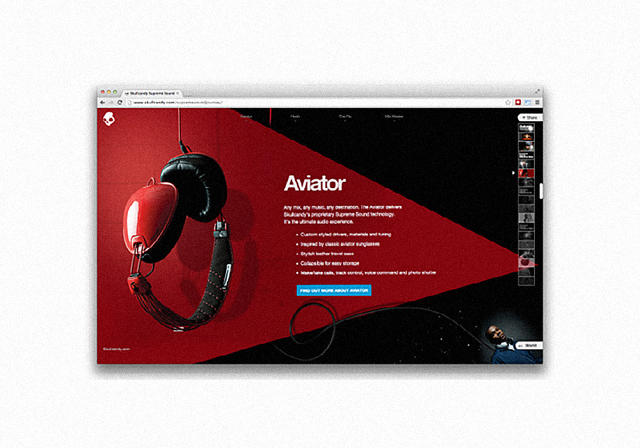
Skullcandy’s Supreme Sound site is a great example of a visual-based navigation system. Not only does it have a simple and understandable vertical menu on the right side of the screen, but the icons themselves are enticing pictures. The vertical menu highlights in red the current location (providing orientation), while the horizontal menu includes drop-downs for further exploration (providing navigation). If you’re interacting with the content, the blue calls-to-action also provide unmissable next steps (thanks to their standout color).
2. Visual consistency and predictability.
Consistency is important in all aspects of interaction design, not just visuals. Inconsistencies in visuals are glaring (just check out the The World’s Worst Website Ever to get a vision of design hell). Consistency creates a sense of logic in how your site is designed and arranged, which creates a more gratifying experience (happy users are returning users). People prefer consistency because, as mentioned, it improves predictability, which increases learnability. And when your interface is easier to learn, it’s also more usable.
The real trouble with inconsistency is that it increases the so-called “cognitive load.” As Kathryn Whitenton, UX Specialist at the Nielson Norman Group, explains in an article on the topic, cognitive load is how much the users have to think when using a product. Every inconsistency forces the user to stop and process what the difference means, why it’s different, and how it affects their behavior. Therefore, the less inconsistencies, the smoother the interactions, and the better the experience.
Because inconsistencies are such a consistent problem, the two best strategies to combat them are following UI design patterns and using a style guide.
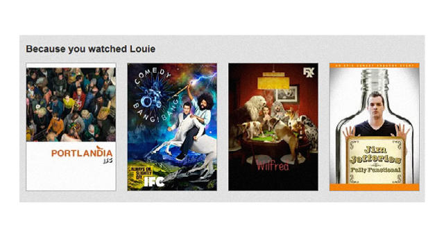
Think of UI patterns as design best practices geared toward use. Since users are already familiar with design patterns, their use reduces the learning curve for your interface. Common UI patterns include carousels, related links, slideshows, and more. For instance, Netflix employs a “Related Content” UI pattern to help users find other movies or shows they might like. Because the content is intelligently generated, the interaction with the user feels more like a person suggesting something helpful. This isn’t a groundbreaking design, but it is a quick and effective solution that makes your interface feel alive.
Of course, UI patterns aren’t just plug-and-play templates, so you should still customize them based on the look and feel of your site. To find the right patterns for your product, check out any number of pattern libraries, where you can browse patterns by their category, like “navigation” or “input.”
While UI patterns help improve familiarity, style guides ensure site-wide consistency. Style guides are manuals that list your product’s specific preferences for any design specifics that could be hard to remember— things like the size and font for all site content, color gradients for secondary versus primary navigation, the behavior of buttons upon clicking, etc.
At UXPin, we create our style guides as we update our site. This helps eliminate extra work down the line because we can just add new screenshots with technical details to our internal company wiki. This “chop and paste” method works perfectly for lean style guides that can be shared with the whole company. Yelp, Starbucks, and MailChimp all have great examples of style guides.
When people are online, they usually say they’re “looking” at a website, not “interacting” with one, even though the latter is more accurate. We rely heavily on sight, and visuals guide us in the creation of our opinions, our solutions to problems, and what we believe is our best course of action. Because interaction design is so closely linked to the user experience, using smart visuals to create the best UX will indirectly but assuredly lead to better interactions.
This chapter from Interaction Design Best Practices: Mastering the Tangibles was published with the authors’ permission. Download the entire ebook for free here.
[Top Image: Flickr user Patrick Hoesly]
(216)
