The booming menopause economy has its very own aesthetic
By Margaret Andersen
First there was millennial minimalism. Then came Gen Z maximalism. Anytime there’s a clearly defined “new market,” an aesthetic ultimately follows. But what about life’s later stages?
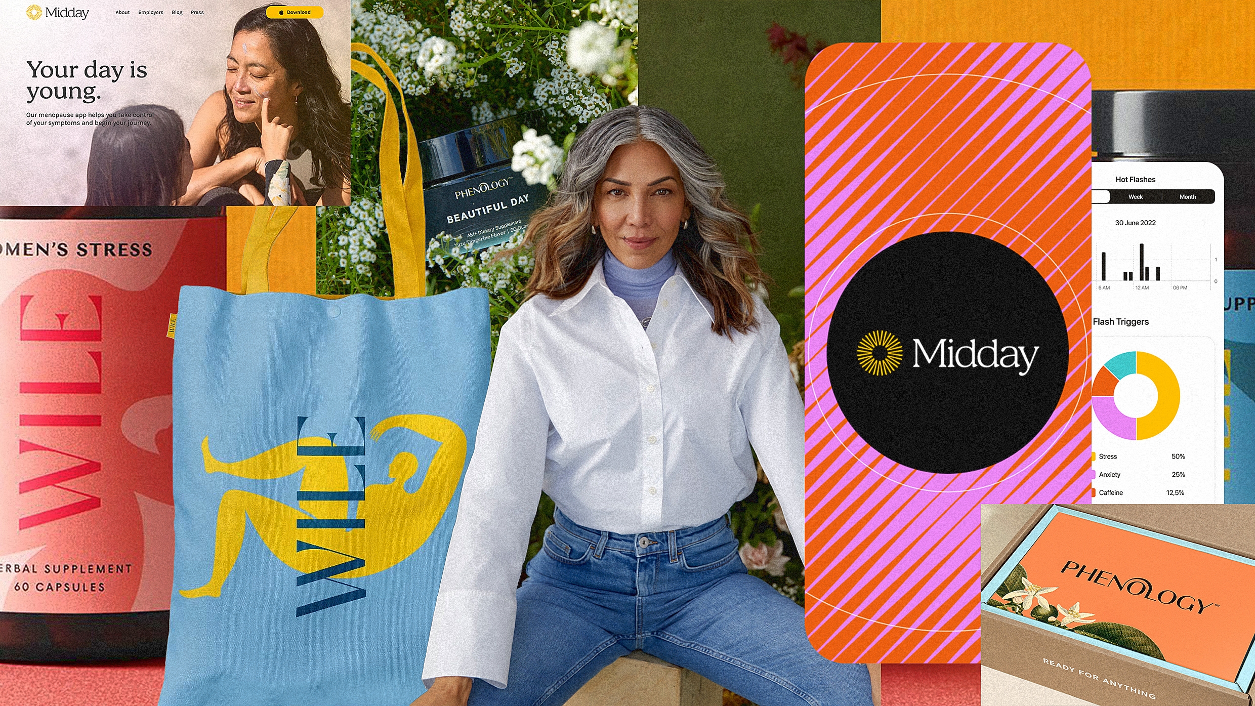
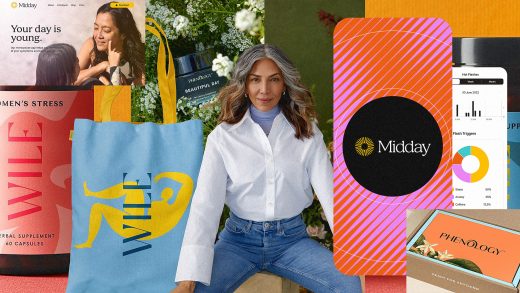
Historically, trendy branding has been a young person’s game, but in recent years, there’s been a surge in companies marketing to women entering menopause. From telehealth startups, including Alloy and Evernow, to celebrity-endorsed (and -founded) beauty and wellness brands, such as Stripes, the menopause market, once largely ignored by investors, is now estimated to be worth $16 billion by 2025.
This influx of funding and social awareness has motivated brands to rethink their design strategies so they can speak more authentically to women entering menopause and carve out a slice of the booming menopause economy. Today, there’s a veritable “menopause aesthetic”—defined by vibrant color palettes, organic forms, hand-drawn illustrations, friendly serif typefaces, and refined wordmark logos.

This approach to design stands in stark contrast to the first wave of menopause marketing, which dates back to the 1940s when it was still considered a disease to be cured, and advertising was overtly sexist. (Menopause self-care brand Womaness even re-created vintage ads for their social channels to show how far the industry has evolved.) “We know that our audience is very aware of marketing,” says Emily Oberman of Pentagram who led the brand strategy, naming, identity, and packaging design for Phenology, a menopause-relief brand. “We had to come to the design from a place of truth that made you feel like menopause wasn’t an end, but rather another chapter in your life.”

Like Womaness’ vintage ad redesigns, there is a playful confidence in the messaging of modern menopause brands. Phenology’s tagline, “for women who weren’t born (August 11, 2023),” positions it as a welcoming yet sophisticated brand for smart, discerning women. “The tagline speaks to so many levels in one sentence,” says Oberman. “It obviously addresses the topic of age, but it also says that this brand is for a woman who knows what she wants and can’t be fooled by tricks or gimmicks.”

Oberman’s team went in the opposite direction of the pastel color palettes that one might associate with health products for “women of a certain age.” Instead, they chose a primary palette of black, white, and beige, with a vibrant secondary palette of electric-neon accents. The identity design centers around an elegant doorway that arches across the logo and appears throughout the system as a container for images, in background gradients, and even as details within the packaging, inviting users to begin their new journey of this life stage.

Similarly to Phenology’s use of vibrant colors and arch motif throughout its branding, David Card, founder & CEO of design agency C42D, created a brand mark in the shape of a sun for AI-powered menopause-wellness app Midday. He opted for a descriptive brand name to create more category distinction in the crowded women’s health market where he’d noticed that the use of proper names starting to trend among menopause brands—Winona, Stella, Caria—are all good examples of that in action. “The brand meaning—Midday—is when the sun is at its apex,” Card explains. “We wanted the app’s branding to reflect that we’re here to empower women to celebrate life’s high points and manage health with precision. By adding a bold color palette and vibrant patterns, along with dynamic lifestyle imagery, Midday’s design represents a future that is fresh and joyous.”

The overarching mission of today’s menopause brands seeks to destigmatize the experience of this life stage through thoughtful design and frank conversation. Designer Abby Haddican says when developing the look and feel for perimenopausal supplement brand Wile, she and cofounder Julie Kucinski began with conversations not just about the product and the customer, but also about the culture surrounding perimenopausal women. “We felt that by the time a woman reaches age 40, she’s been thoroughly pummeled by conflicting messages about her health, her appearance, and her behavior. So, above all, we wanted to create a brand that would embrace her, make her feel seen, and support her through this new phase of life,” Haddican explains.

Wile’s branding fights back against that feeling of invisibility with a bold color palette that communicates a confident sophistication, along with elegant and well-balanced typography, and a series of abstract female-figure illustrations that serve as the core element for the brand and packaging. “I think both the fun and the elegance of our packaging come from allowing the illustrations to communicate feelings that are often difficult to put into words,” Haddican says.

These menopause-design strategies closely align with how many beauty and personal care brands have been marketed in recent years: science-backed without feeling clinical, aspirational but never out of reach—an attainable luxury item that you’d be proud to show off instead of hiding in the back of your medicine cabinet or nightstand. “We see our Wile Women figures as an abstract representation of how perimenopause feels: fluid, shifting, and at times a bit unreal. And yet, undeniably beautiful,” Haddican says.

Women experiencing menopause have been an underserved demographic for too long, and it’s a net positive to direct more attention and resources to supporting women during this life stage. Also, this rapidly expanding wellness category has turned menopause into a VC gold rush. As Amy Larocca reported in the New York Times recently, “There’s the potential not only for a big cultural shift to happen, but for some number of people to profit off it.” She continues, “There’s also a risk that menopause products may carry an updated version of the pink tax—a long-established tradition of charging more for female grooming products (razors, soaps) than their male-pitched counterparts.” Is it problematic for us as designers to assign an aesthetic to a specific life stage? Or is that just an inevitability of our capitalist world? Design is inherently tied to commerce, after all.

While all this may be true, for many of the designers branding these products, this subject is personal for them. “It’s true, women in this category do have a lot of capital to spend,” says Pentagram’s Oberman. “But my first thought wasn’t about how much money there is to be made from this. Being a woman of a certain age myself, I was excited to be a part of something that was finally addressing the needs of women in a way that reflected how I feel. I’m still a bright and vibrant person, so to be able to help build a brand that would continue to speak to a life of brightness and joy was so important to me as a woman and as a designer.”
(15)