Although tipping is generally thought to be a voluntary payment meant to express gratitude to a service worker, the history of tipping suggests that it originated as a way for people to flaunt their wealth.
But what if diners could be made to feel wealthy? Would they leave bigger tips? And could simple exposure to a color do the trick? My colleagues and I recently completed a study that explored how the color gold could affect tipping.
Coloring consumer behavior
Many studies have documented how colors influence consumer behavior.
For example, customers who shop in a store that’s decorated with blue, cool colors are more likely to linger longer, buy something, and spend more than shoppers who frequent a store with red, warm-colored decor. Some researchers theorize that this happens because cooler colors make shoppers feel more relaxed and pleasant. Warmer colors, on the other hand, are more stimulating and arousing.
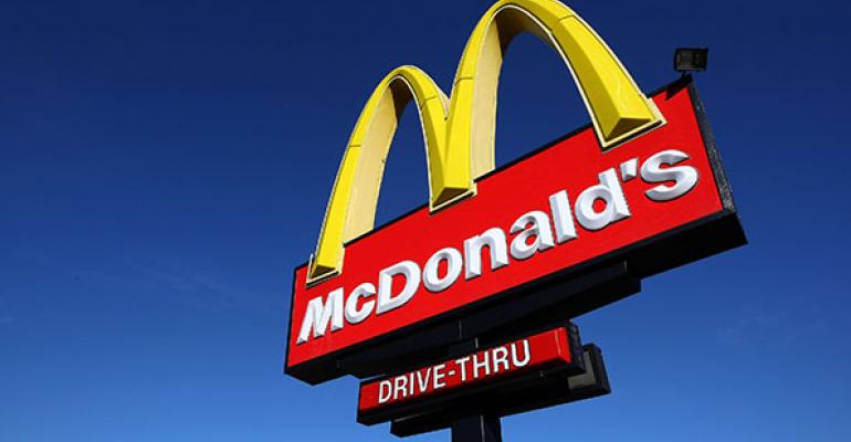
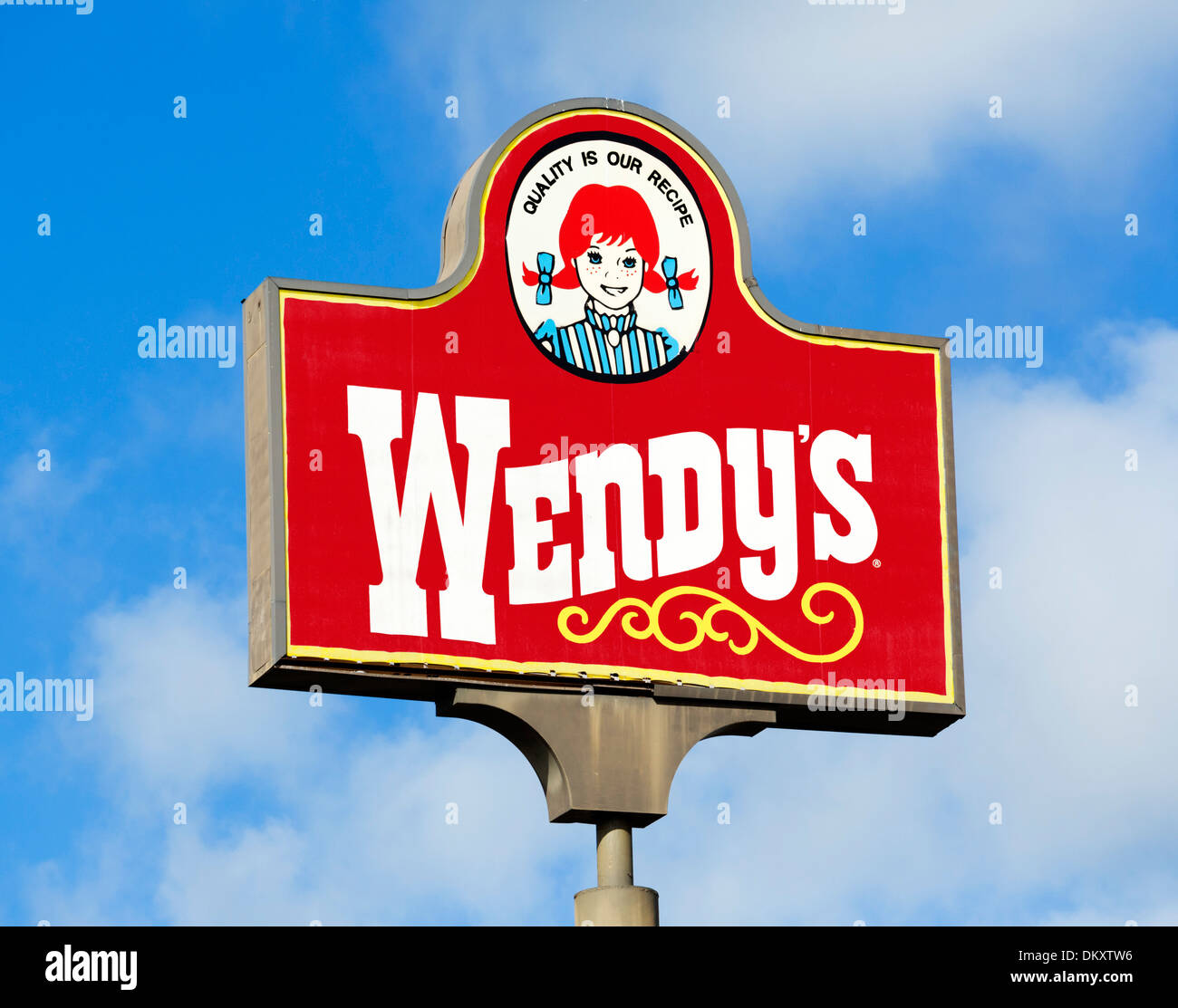
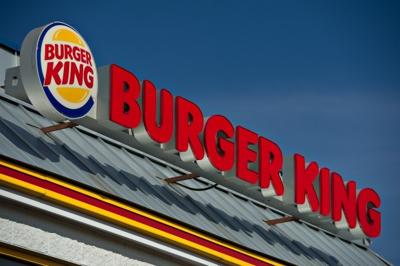
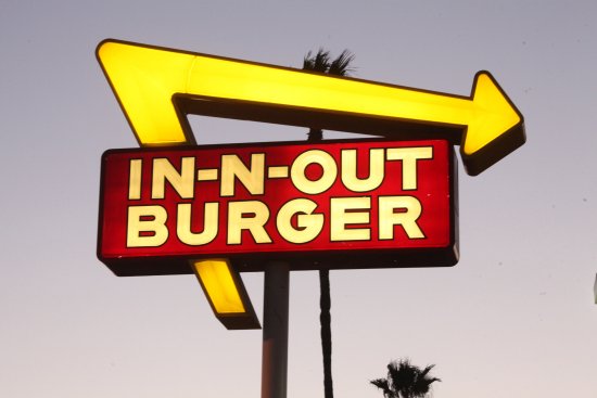
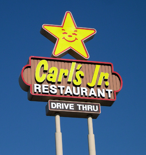
In a clothing store, these stimulating colors might hurt store sales because they could make customers feel rushed. But in a fast food restaurant–a business that wants customers in and out–stimulating colors like red, yellow, and orange might hasten table turnover and increase customer traffic. There’s probably a reason McDonald’s, Wendy’s, Burger King, In-N-Out Burger, Sonic, and Carl’s Jr. all use similar red and yellow color schemes.

A handful of studies have also looked at whether colors could influence the size of waitstaff tips. They found that the size of tips can be influenced by the color of the waitstaff’s hair, clothing, and even lipstick (go for red, not pink).
A golden rule for waitstaff?
Studies have shown that tipping is more prevalent in countries where achievement or status is highly valued. And despite conventional wisdom that the amount of the tip is determined by the quality of service, several studies have shown that there’s a weak relationship between the tip amount and the servers’ efforts. Instead, a couple of studies have found that the tipper’s socioeconomic status or mood has a meaningful relationship to tip size.
In our study, we gave diners their bill in either a gold folder or a black folder. When we compared the tip amounts, we found that customers who received their bills in the gold folder left, on average, 21.5% tips, whereas those who received the black folder left 18.9% tips.
Most bill folders are black. What if people simply tipped more because a gold folder was something novel? So we tested the impact of an orange-colored bill folder, only to find that this didn’t lead to bigger tips.
The effect of gold goes beyond the bill folder. We created a mock restaurant and found that customers who were seated at tables with gold tablecloths left larger tips than those who were seated at tables with white tablecloths.
Why might this be the case? The color gold has long signified something special, precious, and superior. It can subtly connote status, which is why companies will use gold when marketing their rewards programs–think Starbucks and American Express’s Gold Card.
It seems that mere exposure to the color makes customers feel like they’re in a restaurant that caters to high-status people. And when people feel like they’re wealthier, they tend to be more inclined to flaunt their wealth. Of course, no amount of gold decor can make up for a messed-up order.
Na Young Lee is an assistant professor of marketing at the University of Dayton. This post originally appeared on The Conversation.
(37)
