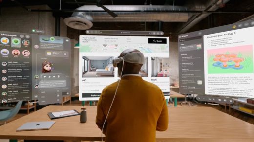
The era of spatial typography is here
Apple’s iPhone kick-started an app economy that changed the look of user interfaces and graphic design. Might the Vision Pro and spatial computing do something similar? At least when it comes to type design, some think it’s inevitable.
Spatial typography designed for augmented or virtual reality opens up a third dimension for type design, says Phil Garnham, executive creative director at the type design company Monotype.
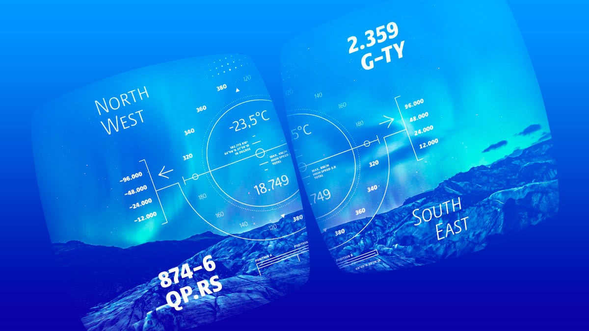
“AR type will have depth, it will rotate, you will be able to position it, twist it,” Garnham tells Fast Company in an email. “With a third dimension comes greater interactive possibility.”
Those possibilities might be something novel, like being able to walk into a book, or other more utilitarian uses, such as type that configures itself to a user’s head movements, Garnham says. “The full spectrum of typographic experience will be customizable.”
On the printed page, type is static, but in a headset, it can be dynamic. Spatial text will require typography that can adapt to various backgrounds in an instant—with a twist of the head, for example, that background could change from dark to light. “Sticky info text,” or text pinned to a real-world object, could be used as a nutrition label on packaged food or show local recycling information.
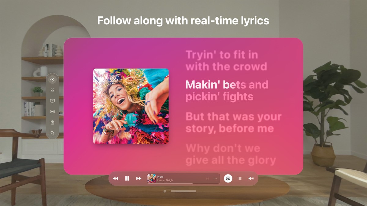
Garnham says he believes spatial type designers will “stick to the raw principles of legible typography,” while creators and brands dream up the fun stuff. “It will be independent creatives and brand makers that unearth AR’s true expressive potential with type,” he says.
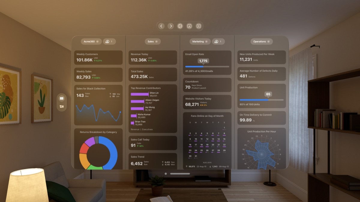
Already, Google Fonts has some recommendations for type designers working in AR and VR, like placing text for long reading in a UI region. And while designing for 3D makes it tempting to design with 3D type, that’s not always the best idea, since it hinders legibility, designer Niteesh Yadav wrote for Google Fonts’ AR/VR typography guidelines. If it’s absolutely necessary, though, he says to adjust the letter spacing to improve legibility.
Text will also need to be adjusted for factors like changing distance so it doesn’t get blurry. “Extra care is required while designing AR/VR applications,” Yadav writes.
Monotype predicts geometric sans serif typefaces will be popular in augmented and virtual reality. That theory aligns with a recent study Monotype and the applied-neuroscience company Neurons conducted on the emotionality of fonts. They found that these sharp sans serifs suggest the idea of “digital innovation.” Does that mean we won’t be seeing script fonts in VR? Only time will tell.
(15)

