Craigslist is one of the ugliest websites on the Internet. The home page is an indistinct wall of links and text, the site is tough to navigate, the postings are cluttered, and the design has barely changed in the past 15 years. At a time when websites are competing to offer the best digital experiences, Craigslist is the pinnacle of user unfriendliness. And that’s exactly what makes it brilliant, says Pascal Deville.
Deville is founder of Brutalist Websites, a site dedicated to the most frustrating design on the web. The site takes its name from the controversial architectural movement Brutalism. To some, Brutalist buildings are poetry in concrete; to others, they’re chilly monoliths. Web design, Deville argues, has a similar dichotomy. Here’s how he describes a Brutalist website:
In its ruggedness and lack of concern to look comfortable or easy, Brutalism can be seen as a reaction by a younger generation to the lightness, optimism, and frivolity of today’s web design.
Appropriately, Deville’s website has some of the hallmarks of the content it espouses—a rudimentary layout, one of the most basic typefaces (Courier), an infinite scroll, and no tabs or ways to sort the dozens of blog posts.
It’s a far cry from the intuitive navigation and elegance most app and web designs strive for today. That Deville’s site deliberately celebrates web pages, which stray from the status quo, feels to me like a silent protest—a corner of the Internet that’s bucking best practices, a middle finger to user friendliness.
I’m not exactly right about that.
“I wouldn’t call it a protest but a shout-out for more humanity in today’s web design,” Deville says. He views his site as a bastion for a segment of Internet culture of people who built scrappy websites themselves as opposed to using services with pre-canned templates like Squarespace. “Terms like UX and user friendly don’t have a lot of soul or guts and treat everything like a product. They also killed a lot of the web culture, which seems to find a voice on Brutalistwebsites.com.”
Deville posts short confessionals about why the web designers he features chose this aesthetic. Some do it because that’s all they know how: “It’s cute and represents our idea very well,” Valeria Mancinelli of the site Theimportanceofbeingcontext.info—which is essentially a beveled three-column chart of YouTube links (no embedded video) to performance art pieces—tells Deville. “And it’s the only way my boyfriend can make a website. Can’t ask for more. Actually I would love a gradient as a background, but he’s not able [to add one].”
Others are doing it to make a statement: “I think it is both an assertive way of talking about the nature of mass communication in a digital age and a provocative answer to a certain—and boring—expectation of contemporary design. Apart from all that, it is simple and economical,” explains Germano Dushá of Banalbanal.org, an online art gallery whose home page is an animated neon green logo and a couple of links.
As the Washington Post points out, it’s not just small or outdated blogs that have adopted the aesthetic. Bloomberg, Drudge Report, and Adult Swim are all considered Brutalist, thanks to their ’90s motifs. (Perhaps it’s today’s developers getting nostalgic for the Internet of their youths.) You could also argue that Instagram’s new logo is a bit Brutalist because of its gradient—the product of one of the most basic tools in Microsoft Paint.
Aside from their anachronistic aesthetics offering a break from too-polished pages, Brutalist websites open up a conversation about what we see on the Internet and why. Just as a Brutalist building’s beauty is often in the eye of the beholder, so too is a Brutalist web design.
“Calling something ugly is based upon someone’s taste and has to be seen in context of what’s around,” Deville says. “In terms of web design, ‘Brutalism’ can be described as a movement of designers and developers trying not to hide behind an ever-beautiful surface, but to show truth and honesty in their craft instead.” Deville has a point. Many of the complex, polished websites you see today belie messy back-ends filled with work-around code. With Brutalist sites, what you see is what you get: Basic code expressed with an equally basic design.
We asked Deville to share his 10 favorite Brutalist websites. His comments below:
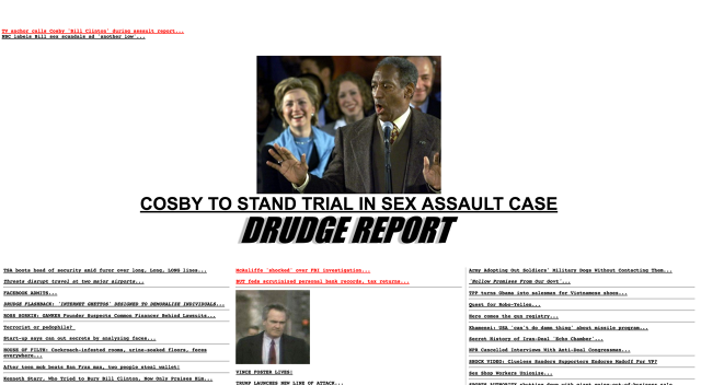
Drudge Report
“This is just an insane piece of Brutalism on the web with 3 million uniques a month. One of my favorites of all times. Jason Fried, the founder of Basecamp.com, wrote a great piece about it called ‘Why the Drudge Report is one of the best designed sites on the web.'”
Sebastian Ly Serena
“I’ve discovered Sebastian’s website some time ago, and since I added it to Brutalistwebsites.com, it’s been featured on BoingBoing.com and other blogs. It’s a piece of Internet art and should be exhibited at MoMA.”
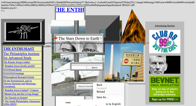
Brandon Joyce
“Brandon’s website is actually a magazine with great content but with such a snotty appearance (aesthetic- and code-wise), which makes it hard to stay focused.”
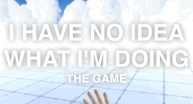
Dude Push by Sos Sosowksi
“Dude Push is the latest brainchild of game developer Sos Sosowski and one of the strangest websites out there right now. The game doesn’t seem to have a clear goal yet as the website says: ‘I HAVE NO IDEA WHAT I’M DOING—THE GAME.’ In terms of Brutalism, it is a benchmark for all game teaser websites to come.”
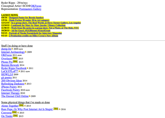
Ryder Ripps
“Ryder is the first real artist in the age of social media I know. His agency OKFocus does bad-ass applications, combining the latest technology with the web’s latest memes. But when it comes to his personal website, he only believes in Notepad.”
Very Interactive by Laurel Schwulst
“I love Laurel’s work and think she’s one of the original sources of contemporary Brutalist web design. Although she wouldn’t call her work Brutalist, I think it is in all possible ways by playing around with what’s available from basic HTML and a great passion for details.”
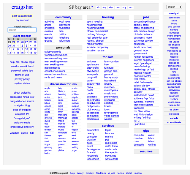
Craigslist
“Craigslist does everything right in doing everything wrong in terms of branding and corporate image. It’s a somewhat straightforward service that makes a point with nothing but being a public blackboard with blue links you can trust.”
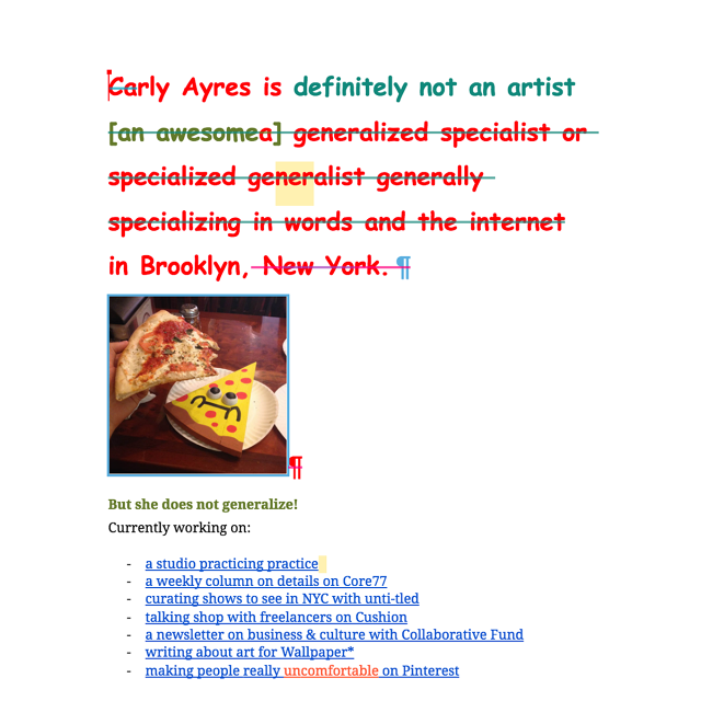
Carly Ayres
“Carly works at Google’s Creative Lab and uses Google Docs as her personal website. Everyone visiting her site can collaborate and edit the document, which certainly doesn’t help to make it look nice.”
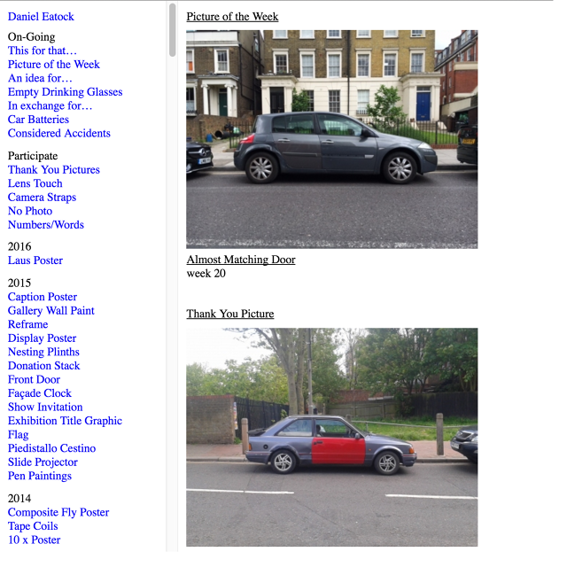
Daniel Eatock
“Daniel is an artist and the cofounder of Indexhibit and showcases his great work using the default Indexhibit template—an honest statement of believing in your own product.”
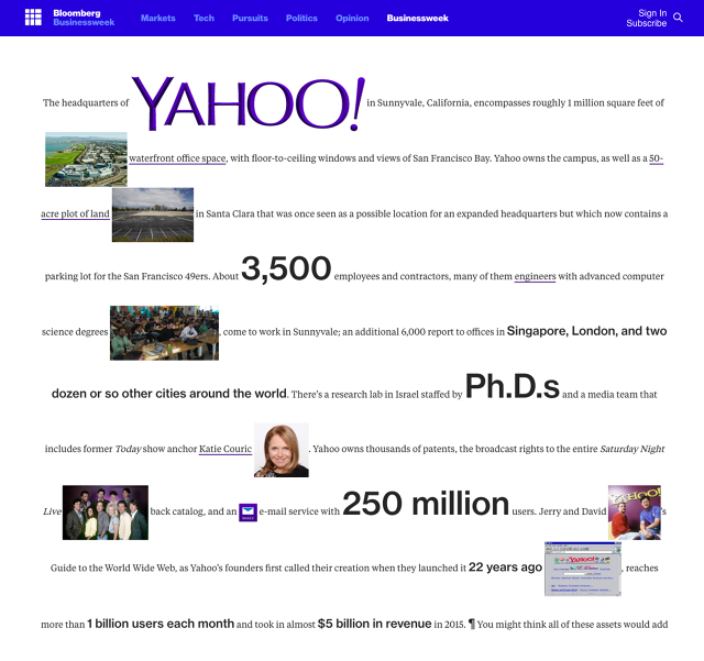
Bloomberg Businessweek—Yahoo
“This special on Yahoo by Bloomberg Businessweek is a great example of how Brutalist web design can exist in a commercial surrounding. I’m still wondering how their in-house design team managed to convince the Bloomberg bosses about the approach.”
Fast Company , Read Full Story
(82)
