Nike and graphic design firm Sawdust up the branding game.
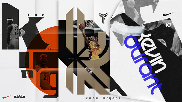
Superhuman athlete, comedic actor, and $500-million brand LeBron James is now a typeface. So are Kobe Bryant and Kevin Durant. Working with the London-based design firm Sawdust, Nike has created fonts for some of the most popular basketball players. Eye-roll inducing? Certainly. It’s also smart—if used the right way.
Composed of Jonathan Quainton and Rob Gonzalez, Sawdust has carved a niche in the bespoke typeface business mostly working with editorial clients. They met while studying graphic design at Oxford and after working separately as freelancers and at agencies in Denmark and London, the two banded together to open their own studio in 2006. (You might recognize their identity for Fast Company‘s Innovation Festival and Innovation by Design Awards.)
Nike Basketball has worked with Sawdust on and off for years to create logos for its players, like Maya Moore and Blake Griffin. And while a logo is the norm for marketing athletes today, Branding 101 will tell you it’s only one part of an identity system. To build a stronger personal brand, the next logical step is to create a typeface.
“If a player can have a logo, then why not a typeface too?” Gonzalez says. “In the long term we see no reason why this kind of an idea shouldn’t be embraced by not only athletes but in all kinds of other arenas, if a business can have its own typeface then why not a person, why not an app, or a product range? We’re excited by the prospect of new and innovative type going out into the world.”
The fonts Sawdust created for Kobe, LeBron, and Durant riff on the players’ existing logos.
“We don’t believe there is ‘one style fits all’ approach to custom typography for athletes, each typeface was based on many components associated with the athlete in order to express their own unique abilities and strengths,” Quainton says. “The brief was consistent across all three players: the typeface needed to be an extension of each of their existing brands.”
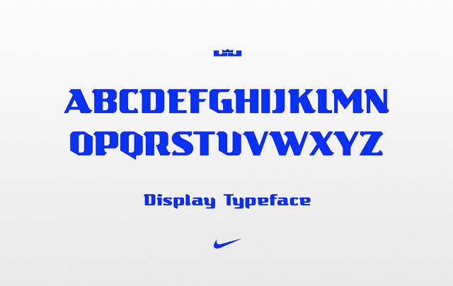
To create a typeface from the athletes’ existing logos, Sawdust decomposes the logos’ structure and form and translates them into letterforms. Kevin Durant’s logo composed of a minimalist K and D was more or less directly extended into a full alphabet. Though LeBron has his initials in his logo, it took more finessing to create the typeface.
“We found the L and J letterforms within the logo were too simplistic for us to use as part of the final design, however they did provide us with a good base, for instance having a low x-height and being super wide and extra bold,” Quainton says.
“We also wanted it to have a sense of ‘kingliness,’” Gonzales says. “Some of the ways we managed to achieve this was by having powerful sweeping serifs, which had a feeling of heritage—bold and sharp in style, yet graceful—all of this while trying to have a refined and regal edge.”
The ultra-stylized typefaces are are more about recognizability than legibility, which underscores their value. “A typeface has a different role to that of a logo, the combination of characters has to be harmonious and there needs to be enough versatility in order to allow dynamic use of the font,” Quainton says. “Legibility can be pushed when designing a display typeface because it will generally be used at larger sizes and generally have less amounts of text; this allows for greater expression,” Gonzales adds.
In today’s multi-platform media environment, brands communicate through apps, websites, video, print advertising, and merchandise. A logo isn’t always the most versatile, and typefaces are more scalable. For example, the identity Pentagram’s Natasha Jen created for the brand Teabox features a custom typeface that can comfortably exist on packaging, instructional guides, letterhead, and the website. It unifies all of the material in a way that just having a logo doesn’t.
Sawdust says Nike commissioned the typeface for season-long use, exclusively for its products associated with the athletes: apparel (like slogan tees), shoes, backpacks, and sports equipment. (Nike’s designers determine how the typeface is used on its products, not Sawdust.) For branding to be effective, it should be used consistently and repeatedly. If these custom typefaces have as short shelf life as Sawdust says—just one season—they veer into marketing stunt territory.
At least LeBron’s letterforms are better designed than his hipster PoMo sneakers.
[All Images: via Sawdust]
Fast Company , Read Full Story
(75)
