What the DNC 2024 logo reveals about the Democrats’ strategy
Since planning for national conventions usually begins long before parties have picked their presidential nominees, the branding for Democrats’ and Republicans’ most recent conventions have either been generic or played up the host city. This year, though, with one incumbent president and a former president who’s being treated in many ways like an incumbent, it looks a little different.
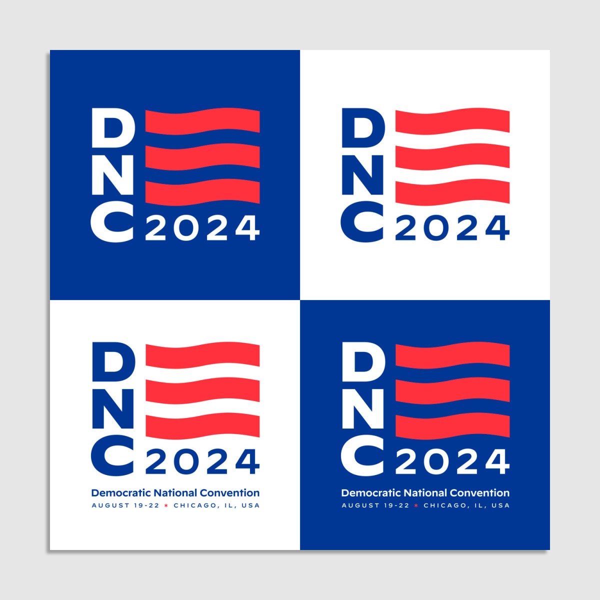
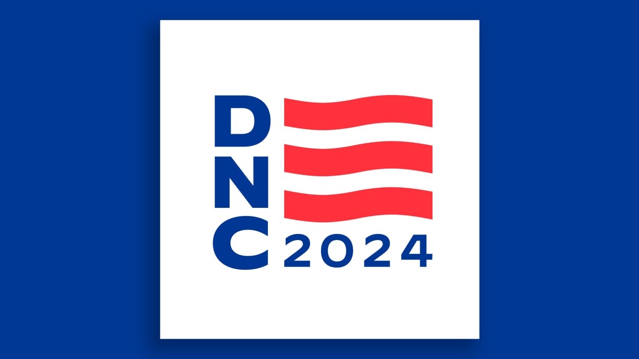
For the Democratic National Convention this summer in Chicago, the branding borrows from President Joe Biden’s. The DNC 2024 logo uses the three red, waving stripes used to make the E in “Biden” in the 2024 Biden-Harris logo. It also makes use of Decimal, a sans-serif typeface from Hoefler & Co. that the Biden campaign has used since 2020.

DNCC leadership worked on the identity with Wide Eye, the agency that’s handled design needs for three successive Democratic conventions as well as the Biden campaign and White House. Wide Eye founder Ben Ostrower says it was “clear early in the design process that framing the convention as an extension of the Biden-Harris campaign was a major strategic priority.”
“So, our work on the visual identity self-consciously centers the momentum of the last four years—and captures the spirit of our country moving forward together,” Ostrower says. “The color palette is distinctly American, and represents the depth and power of the ideals and vision of a unified Democratic Party.”
The primary color palette for the visual identity includes “Democracy Blue,” a slightly deeper shade of blue that fits within the Biden brand system, and Biden-Harris Red. Biden-Harris Blue is a secondary color along with a lighter “Chicago Blue” that pays homage to the blue in the Chicago flag. The distinctive six-point star in the city’s flag shows up as a dingbat between the date and location information in one logo lockup, and the DNCC expects to use more iconography referencing Chicago in the coming months.
The last time Democrats had a convention logo that borrowed directly from a candidate logo was 2012 for the convention to renominate then-President Barack Obama in Charlotte, N.C. The logo reimagined the Sol Sender-designed Obama O logo, replacing the three red stripes with red silhouettes of a group of people under a blue arch.
DNCC Executive Director Alex Hornbrook said in a statement that the new 2024 logo “is designed to capture the strength, unity, and pride that people across the country have in the United States of America. Come August, our job will be telling a story that demonstrates these qualities to the American people and showcases the record and vision of President Biden, Vice President Harris, and Democrats.”
The RNC looks a little Trumpy
Meanwhile, Republicans announced their 2024 convention logo last June, and it looks a little Trumpy. The logo is encased in an outline of the state of Wisconsin, similar to how former President Donald Trump’s campaign logo has the outline of a rectangle, and the logo shows five stars laid out horizontally, another element from Trump’s logo.
One thing you’ll notice comparing major party convention branding over the years is that the GOP is much more committed to its Thomas Nast-given animal symbol than the Democrats. An elephant has appeared in the logo for every Republican convention of the 21st century so far. The 2024 elephant icon is new. Flat-footed, marching, and whipping its trunk like a bullwhip, it’s a more confident depiction of the Republican mascot than some of the other elephant icons used in recent convention branding.
Wisconsin is a must-win battleground state that Trump won in 2016 then lost in 2020. To me, including it in the logo along with the all-caps, sans-serif font makes it look like the logo for a well-funded statewide candidate, no? According to 2024 Republican National Convention CEO Elise Dickens, the map is a means of communicating the convention’s economic impact for the state.
“The purpose of that really is because we expect $200 million in economic impact is going to impact the city of Milwaukee but also the communities surrounding, throughout the Badger State,” she told Fox 6 Milwaukee.
This particular map was called out by the Milwaukee Journal Sentinel for chopping off a portion of the Door County Peninsula, but the region’s tourism organization was unbothered. “Wisconsin maps of all types have shown a variety of configurations for the Door Peninsula and our surrounding islands, with some being more representative than others,” Destination Door County chief communication officer Jon Jarosh told the Sentinel. “But we’re still there, and all is good.”
This story was republished with permission from Yello, a newsletter about politics, art, branding, and design.
(9)


