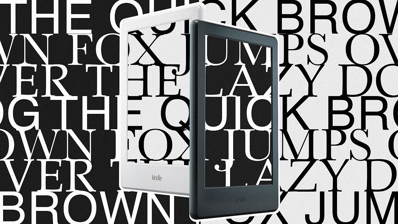
Which Font Should I Use On My Kindle?
Baskerville, Bookerly, Caecilia, Georgia, Helvetica, OpenDyslexic, Palatino, the mysterious “Publisher Font”: According to my iPhone’s Kindle app, all of these typefaces are available with a button press, and that’s the problem. If you’re anything like me, as soon as you try to switch fonts, everything looks wonky and borderline illegible. And you burn 10 minutes going back and forth, squinting at serifs, and forgetting that you were supposed to be reading leisurely in the first place.
I wondered, which typeface is the right typeface—easy to read, classy, and tonally appropriate for most books? Or at least, the best typeface most of the time? And to find out, I asked book and type designers their opinion on the topic.
The quick answer may sound like a lot of setup for an obvious answer:
You should use whichever font you want to read at whichever size you prefer. That’s probably the best font for you. (And if you want my personal recommendation? Go with Georgia or Palatino.)
But in discovering all of that, I learned a lot along the way, including why most e-books don’t have an optimal font, what we lose when a book is translated to digital, why you shouldn’t feel bad for reading in Helvetica (a typeface generally considered to be slower for reading large blocks of text), why countless hardware and software standards make it hard to choose the right font for all screens, and the one font most experts would choose for all those screens if forced.
The Problem With Type On E-Readers
Mass customization according to personal taste. That’s a benefit of reading e-books. The sight-impaired can make letters are large as they need to, without making the book they hold any bigger. And if I feel like reading The Odyssey in Comic Sans, there’s probably some combination of file format and app to make that dream possible. Fun!
But what about the power of well-thought-out design? If the masses always knew best, most designers would be out of a job.
Anna Thompson is a designer at Penguin Random House. She spends her days making the countless tiny decisions that go into any printed book that you read. That ranges from the typeface, to the spacing between letters, to the spacing in the margins, to whether or not a lot of words are breaking between lines with hyphens, to how wide the gutter line is (that’s the center space in books that separate the text on the left and right pages).
“As far as a print is concerned, I’ll read a manuscript, pick up the nuances, think about the origin of a font, and an origin of a story,” Thompson says. “There’s a lot of little nuanced things that go into picking a font, and sometimes it’s about the cast-off of a book—that’s basically the number of pages in a book. Books are still printed in signatures of 16 pages, which means your book has to fall on a multiple of 16. So there are all these tweaks you do, maybe the font is a little bigger, or you make the gutter margin a little bit wider because it’s thicker, so when you unfold the book, you’re not going to get your text creeping too close to the center of the line.”
It’s, like much of design, a combination of art and ergonomics. Thompson wants the book’s text to feel thematically tied to the source material—so she’ll pick different fonts for books on cooking than she would meditation than she would Shakespeare than she would pop literature—but it also has to be comfortable to read. “The one thing I would say is, if you don’t notice the design, in some ways, I’ve succeeded,” she says. Her test of her own work is often to squint at the page, and see if the words blur together into orderly blocks of text.
However, when one of Thompson’s designs is ported to Kindles and iBooks, all the formatting magic is destroyed. “If I set a book in 11-point font, and you wanted to read it on 12 or 10 on a Kindle, that’s going to change the way that the words are placed on the page,” Thompson says. “And it’s not something that anyone is going to pull their hair out over, but all of that to say is, the beauty of the Kindle is the reader has so much control, but that does compete with what a printed type designer is doing.”
The problem is only compounded by the fact that the font Thompson chooses for a print book very rarely makes it to an e-book version. The Publisher’s Font you see on Kindle has to be licensed separately, and embedded in the e-book file that could show on countless iterations of screen sizes and display ratios. Neither of these steps are usually taken due to cost and conversion logistics (every e-book seller converts books to their own formats a little bit differently anyway). And then, there’s the simplest of all realities that prevents publishers from providing their own fonts: Many e-book readers don’t even default to the Publisher’s Font, so any extra effort or investment put forth by the publisher would be lost to the reader.
However, as Liisa McCloy-Kelley, VP and director of Ebook Product Development & Innovation, Penguin Random House, explains, the most fundamental reason that print fonts aren’t 1:1 with e-book fonts comes down to technical limitations. “There are still fonts that don’t look good on screens,” says McCloy-Kelley. “Many lightweight fonts don’t hold up with all types of devices or across all backgrounds. Some don’t work well as they are resized up or down. Kerning and tracking are still not well supported in HTML/CSS and so the subtle things you can do with ligatures and other typesetting features in print are still missing for many digital reading experiences.”
E-books offer users typeface customization, sure, but that customization is generally within boundaries that technology companies have decided can work on screens.
What Top Designers Would Pick For Their Kindles
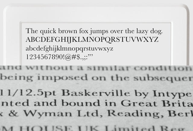
When pressed, even though she doesn’t own a Kindle, Thompson is a Baskerkville fan, the most ornate, and if you will, bookish of the Kindle selection. “It has respect,” she says. And indeed, it’s 258 years old. Robert Slimbach, the principal type designer at Adobe Systems, agrees that Baskerville would be his go-to.
“I like Baskerville because it is very well suited for reading lengthy text in a full-page format. Its classical characteristics and open counters make it very inviting to read and less fatiguing to the eye,” says Slimbach. “Baskerville is the kind of design that recedes into the background, allowing the reader to focus on the content of the text rather than the type itself.”
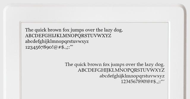
It’s almost convincing. I pull up my iPhone—call it my Kindle of choice—and swap my text to Baskerville. And I can’t stand it. The letters look emaciated, with so much ornamentation that they feel like they’re trying too hard.
This difference, between its skinniest and widest parts of each letter, are what typeface designers call “contrast,” and it’s why, especially on screens, even this age-old typeface can be tough to discern. “Since Baskerville is a fairly high contrast font style, there is the possibility that it might not always hold up on certain devices,” says Slimbach. Type designer Tobias Frere-Jones echoes this sentiment. “[Baskerville’s] very dramatic back-and-forth of weight can be really compelling if you have the resolution to render it properly,” says Frere-Jones. “You would for print, but you absolutely would not on a Kindle or any other screen really.” Frere-Jones calls its thinnest sections “spindly” and prone to “disintegrate on a page.” Because of that, he prefers a lower contrast (or in this case, thicker) serifed font, Georgia. Its components can rasterize (or turn into pixels) properly on a screen, but it still has unique glyphs that, to Frere-Jones, give the typeface some personality.
“Apart from the technical criteria…I think there’s something that’s both comfortable and credible in its personality that I like about Georgia,” says Frere-Jones. “Some typefaces [with personality] distract from the content. But Georgia doesn’t do that.”
What I Would Pick For My Kindle
Checking in on my own Kindle app, I’d realized I’d gone with Georgia as my default instinctually. And while Slimbach prefers Baskerville, he supports Georgia as a solid second pick, given its flexibility across screens of many resolutions.
But Georgia wasn’t the only Baskerville alternative experts liked. At the urging of Thompson, I checked out Palatino, a midcentury font developed to mimic types created in the Italian Renaissance. I’d never thought twice about it (to be honest, I always saw it as a poor man’s Baskerville), but in practice, I found it combined the character of Baskerville with the lower contrast readability of Georgia. Bigelow likes Palatino, too. In fact it’s his first choice of Kindle font—though he admits some level of bias, as he and his colleague Kris Holmes studied with its designer, Hermann Zapf. Frere-Jones feels it would “be a good choice,” if not his choice. Slimbach may be the least bullish on Palatino of the group. “While I think it is a brilliant face, for my taste it has a little too much personality for most book text applications,” he says.
So hopefully it’s clear that you should feel free to read an e-book in any typeface with any font size that you like. But if you’re asking for my own semi-biased opinion after discussing the issue with a number of specialists, you may want to give Georgia or Palatino a try.
Otherwise, you could always buy a real, paper book. If this Kindle research has taught me anything, it’s that an impressive amount of time and care goes into the presentation of good old printed texts. And it’s a shame that art is lost just because letters are converted from ink to pixel.
Fast Company , Read Full Story
(72)