You can now get a free typography crit from Jonathan Hoefler
Typeface designer Jonathan Hoefler, who founded the type foundry Hoefler & Co. and starred in an episode of the Netflix series Abstract: The Art of Design, is now offering up free typography advice. And all you have to do is DM him on Twitter.
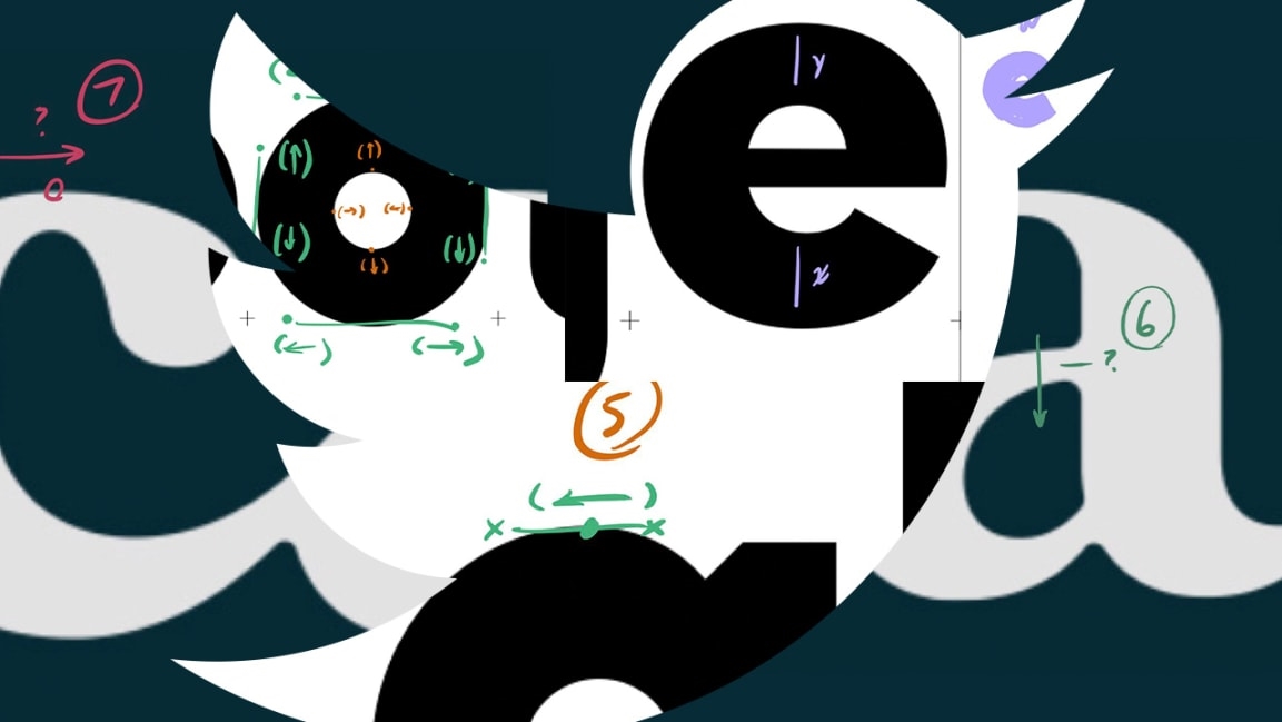
From time to time, I’ve done impromptu type clinics on Twitter. I thought I might try and make this a regular feature, so if you’re working on letterforms and could use a second set of eyes, feel free to DM me. —JH pic.twitter.com/x73Eu28ipM
— Hoefler&Co. (@HoeflerCo) February 24, 2020
Hoefler isn’t the first famous designer to review work on social media. Stefan Sagmeister’s Instagram account is almost entirely devoted to critiquing other designers’ work. The difference here is that Hoefler is advising people in the middle of the design process, and he’s offering solutions to sticking points before a final product. Illustrator Marcos Chin also offers informal advice on his Instagram account with AMAs that mostly focus on the practical side of the design industry, such as portfolio reviews and landing your first job.
For designers, Hoefler’s crit offers detailed, specific ways to improve letterforms. When lettering artist Jessica Hische tweeted that “I have been drawing a single lowercase s for 5 hours and it’s still ‘just ok,’ Hoefler suggested she pivot the “s” clockwise. When a designer tweeted a challenging logo they’re designing for a small French sewing business, Hoefler didn’t see an issue with the original pain point (how the E and T joined in cursive script)—but he offered several other places for possible improvement.
Ahoy, Jessica! Nice talking to you just now. Here’s a thought or two about the S & friends; feel free to use or discard. I wondered if you‘re seeing what I’m seeing… —> https://t.co/Vnbre1RXyt
— Hoefler&Co. (@HoeflerCo) February 22, 2020
For nondesigners, it offers a peek behind the curtain of typography. Something an everyday reader might dismiss actually requires a lot of technical skill to get the proportions to look right to the human eye.
Hoefler told me that the crits started informally, after he noticed fellow designers who had gotten stuck on some challenging letters and offered to help. Now, he plans to make the crits an ongoing feature. He’s encouraging students and designers without a regular resource for feedback to reach out. A more formal post that explains his markup conventions, FAQs, and more, will be up on the Hoefler & Co. blog tomorrow, according to Hoefler.
“I’ve always thought that perspective is the toughest part of typeface design, and a designer’s options are either to put something down and return to it later, or to ask a colleague for advice,” says Hoefler. “I love when I’m able to help a designer find their best ideas—even if it’s a bit of a busman’s holiday, since working with type designers is what I do all day at H&Co.”
Fast Company , Read Full Story
(23)


