Your guide to designing a greener website
About 5.3 billion people use the internet every day. And though we tend to think of the internet as an immaterial luxury that floats around in the clouds (or “the cloud”), the internet is supported by a giant network of data servers that account for 1% of the global energy demand, which is more than the national energy consumption of many countries.
This energy comes from many places, and websites are one of them. There are about 200 million active websites around the world. And because the vast majority of data centers are still powered by fossil fuels, our time surfing the web can be summed up by a simple equation: data = electricity = CO2. “Every single thing we do online has small carbon footprint,” says Marketa Benisek, digital sustainability lead at the London-based digital sustainability consultancy Wholegrain Digital. “It’s small, but it adds up given how many internet users there are and how many things we do online.”
The good news is, websites can be made more sustainable by design. As part of their consultancy work, Wholegrain Digital built two demo websites titled Yuck and Yum (don’t bother searching for them, they don’t actually exist.) Both websites essentially looked the same, but with a few fixes, the team reduced the amount of annual CO2 emissions from 186kg for Yuck to only 1.4kg for Yum (based on 60,000 annual visitors.)
In the following guide, Benisek shares a wealth of best practices for building a greener website that is also pretty, fun, easier to navigate, and inclusive for people with disabilities or those with poor internet connection. We also delve into two case studies—a new website by the Norwegian architecture practice Snohetta, and the long-standing Low-tech magazine, which was founded in 2007 and has been running on a solar-powered server since 2018.
Three simple rules
Every time Benisek works with a new client, her team follows three simple steps: measure, reduce data transfer, switch to a green host.
1. Measure your site’s carbon footprint
To measure the carbon footprint of your website, you can use one of the many carbon calculators available online. Wholegrain Digital has created its own, but there are others like this one and this one. (Each of them use different algorithms, so results may vary.)
Wholegrain Digital’s calculator lets you plug in a hyperlink then gives you a grade (A-F). Once you get your grade, which will depend on the exact webpage you choose to analyze, you can learn about generic solutions to improve your rating, like switching to a green host. But if you want a more specific (and therefore more accurate) portrait of your website, then the company would have to run a paid audit.
2. Switch to a green server
To learn more about green hosting (and see if your site already runs on green energy) you can visit the Green Web Foundation, which is an independent nonprofit that tracks how much of the internet runs on green energy.
3. Reduce data transfer
To minimize the amount of data your website requires, here are tips to keep in mind.
- Write clean, efficient code
- Use SVG graphics and CSS instead of JPEG, PNG, and GIF
- Upload images at the correct scale instead of relying on CSS to resize them
- Use a tool such as TinyPNG or ShortPixel to compress images
- Don’t set videos to autoplay; let users choose to only watch those of interest to them
- Minimize the use of custom fonts
- Stick to modern web fonts like WOFF and WOFF2, which use higher compression methods
- Reduce tracking and advertising scripts that rarely offer any value to the user
- Question the inclusion of every aspect of your site; if it isn’t useful, leave it out
- Employ a caching solution to reduce the amount of processing required to load a page
A note on images
Images are part and parcel of many businesses, but they are particularly crucial for architects, designers, and anyone in the creative industry. You can simply follow the above guidelines and upload images at the right size and format, but you can also get creative. For the Italian renewable energy company Renantis, Wholegrain Digital turned images into gorgeous, minimalist line illustrations, reducing the amount of pixels and colors that need to load on the screen.
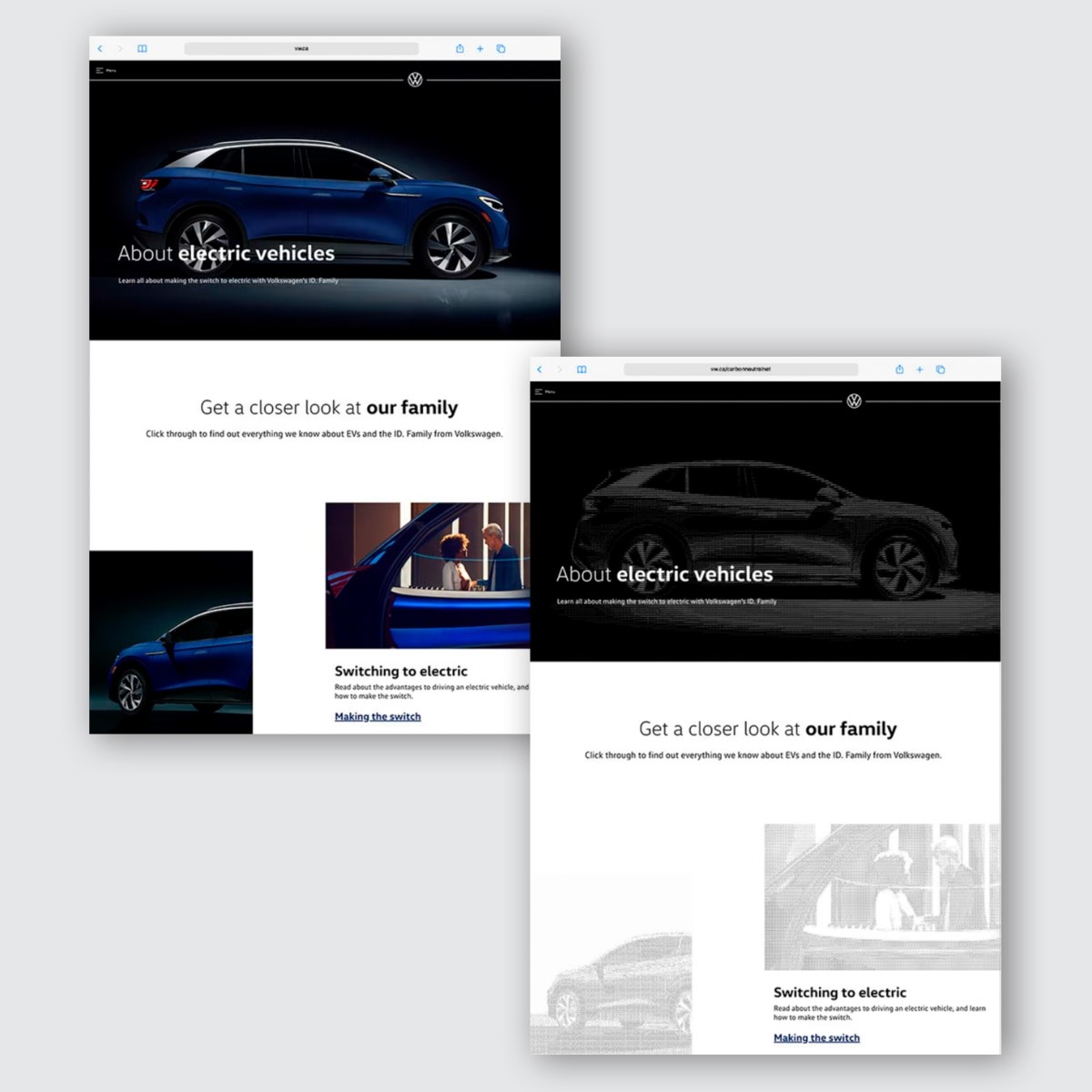
For VW, they created a dedicated website to promote a then new range of EVs but instead of crisp photographs of the cars, they rendered the vehicles in gorgeous ASCII characters. (Note: just because a company hires someone to “green” their website, it doesn’t mean they are greener as a whole. The VW website has since been scrapped and there is no trace of these design choices, but the approach is clever and worth borrowing.) And for British energy company Good Energy, they blurred the edges of some images because “detail is data and data is energy,” says Benisek. The effect reduced the image size by 47%.
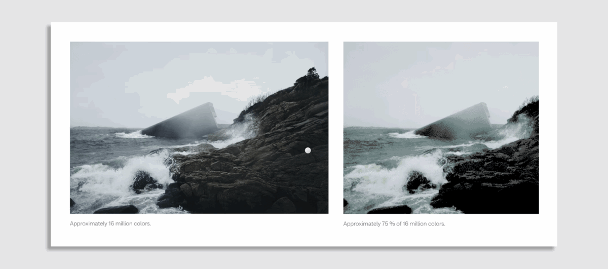
Other options include desaturating images for a black and white effect, or dithering, which creates the illusion of depth in images but with a limited color palette. (See an example of dithering in the Snohetta case study below.)
A note on accessibility
Not everyone has access to the ultrafast Wi-Fi that many of us take for granted. According to a 2020 report by the Worldwide Broadband Speed League, it would take an average of 2m 58s to download a 5GB movie in Liechtenstein, compared to 19h 31m in South Sudan. “Digital accessibility should also be about making content accessible to people who didn’t have as fast a broadband as in global north,” says Benisek.
Case studies
Case study #1: Snohetta
About a year and a half ago, Snohetta started working on a new visual identity and website. As part of the redesign, the architecture firm also wanted to reduce its digital footprint and build a more sustainable website, while sharing learnings along the way. “The building industry is so huge, so all of these incremental things we do on the website page don’t really relate in terms of scale, but we want to say that the design discipline has a footprint, and the digital sphere has footprint, and we need to talk about that,” says Hedda Lilleng, managing director at Snohetta. “Can we do something visually on the web page to make people talk about it more?”
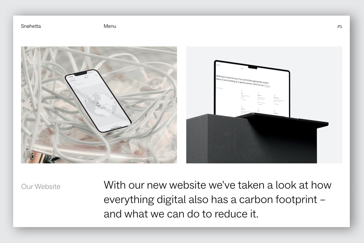
The new website comes with a dropdown menu and a toggle option that lets you choose dark mode, a simplified version of the website with no animations, and dithered images, which they say reduces the image size by about 75% and helps people with slower connection speeds load the site faster. Naturally, the menu is only effective if people choose to toggle it, but Lilleng notes the toggle menu is mostly there as a “communicative tool to start a discussion about digital sustainability,” she says.
Lilleng says the biggest impact actually came from switching to a green host, reducing the number of videos on the site, compressing and optimizing every single image, and removing 10 years’ worth of “digital littering.”
Before, the website’s home page scored 89% on a website calculator. Now, it scores 94%, which isn’t groundbreaking, but it shows that even with a high score baseline, there is room for improvement. Now, the new website is more user-friendly, and more aligned with Snohetta’s vision. It is focused and pared down, and it lets the work speak for itself with no frills. “Clients should be the ones to shine, so it says a bit about how we communicate our values,” says Lilleng.
Case study #2: Low-Tech mag
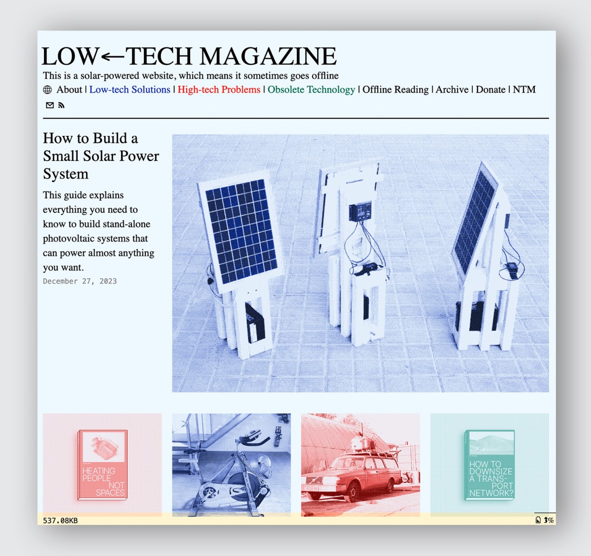
Low-tech magazine is a solar-powered online magazine founded by science and tech journalist Kris De Decker. It runs on a solar panel on the journalist’s balcony in Barcelona, where he lives. When the power goes down, the website goes offline. In the footer of the website, you can see the battery status and the weather forecast for the next three days in Spain. At the time of writing, it shows 50% and three glorious days of sun ahead.
De Decker says the site has been online for about 95-98% of the time, and is only offline for a total of about 20 days a year. Some may see this as enough of a deal-breaker, but De Decker, who incidentally doesn’t own a smartphone, believes it’s time for us to question if we really need to spend so much time online anyway. “Every time the web goes down, I’m losing money, I’m losing readers, but it’s the reality of the power source,” he says. “If you want to switch from fossil fuels to renewable, you have to design a society in way that is more attuned with weather and seasons.”
Depending on what your business is, and where you readers are, this kind of laissez-faire approach may not always be appropriate, but he urges people to consider whether their website needs to be online 24/7: “If you have a local website, why not close your website at midnight?”
That Low-tech mag runs on solar energy is helpful, but De Decker says you don’t have to go that far to be more sustainable. When Low-tech mag switched to solar, the team also redesigned the entire site to lower its carbon footprint even further. They used default typefaces and dithered images, and gave people the ability to read content offline. Most importantly, they opted for a static site instead of a dynamic content management system, meaning that instead of generating content on the fly when a user requests it, the website remains static and is made up of a fixed number of prebuilt files stored on a web server.
Dynamic websites are crucial for businesses like news organizations that frequently need to update the content or provide readers with user-specific information, but they demand a lot of computer power and De Decker says they’re unnecessary for most industries. An NGO, for example, may only update its website once or twice a month. Similarly, Low-tech mag only publishes 12 stories a year, so a static design has proven suitable.
Static websites used to dominate the internet before the dot com bubble burst. Much has been written about the dreadful look of these websites, but at least they weren’t hogging energy. “In the ’90s, all websites were sustainable websites because we had less powerful computers, very low internet connections, and we paid by the minute with a dial-up connection, so you could only go on the internet at home if you occupied your phone line and paid by the minute,” he says. Eventually, computers became more powerful, Wi-Fi brought a slew of wireless gadgets, and websites became heavier and heavier. “I find the internet extremely unattractive [today] and I spend very little time on it,” says De Decker.
The switch to solar, combined with every other design decision the team took, has made the site around 20 times lighter, and therefore made the site’s carbon footprint about 20 times lower, though this is only an estimate. Some changes may seem insignificant, but as De Decker points out, when you’re running on a limited power source, even incremental changes can make a difference. “If we can save 10 watt hour of power per day, the website is online for five hours longer.”
(9)


