How do you design a good app for wearing on your wrist? Keep it simple, stupid.
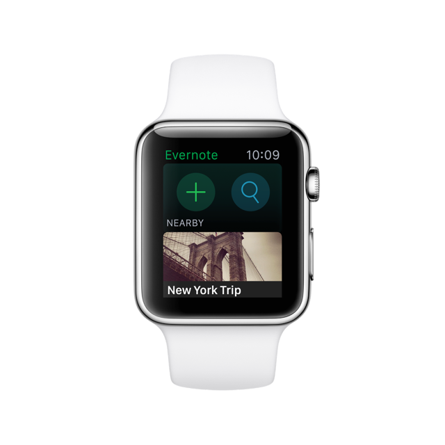
Although the Apple Watch isn’t out until April 24, popular note locker service Evernote has already released an app for it. Unsurprisingly called Evernote for Apple Watch, it allows users to dictate a note, search their note libraries, or surf through a handful of contextually useful notes.
Since it’s one of the early entrants into the Apple Watch arena, we asked Evernote’s VP of mobile products, Jamie Hull, to tell us what the Evernote team had learned from developing the app. Here’s what she told us.
Iconography And Color Is Paramount
Even more so than on other devices, the use of clear iconography and strong colors in a user interface is important in an Apple Watch. There’s just not enough room on a cramped screen for labels, says Hull. The Evernote app, for example, has three different top-level interactions competing for attention on a very small screen. By using strong, colorful iconography, like a green plus button to add a new note, Evernote for Apple Watch can communicate what buttons do in an intuitive way without wasting pixels on a label.
The Shorter An Interaction, The Better
The Apple Watch user interface guidelines recommend that developers keep their interactions on the watch to under 30 seconds. “In our opinion, that’s actually too long,” says Hull. “It should be only three to five.” Having released apps for wearable platforms like the Pebble smartwatch and Android Wear, the Evernote design team has seen that after 30 seconds, users’ arms get tired. The lesson? Design to get people in and out of your app as quickly as possible.
Context Is King
Although Evernote’s previous efforts on the Android Wear platform tried to give users full access to their note library on a smartwatch, Evernote for Apple Watch takes a step back. Instead, it surfaces only five or ten notes automatically, based on how useful it thinks it will be to you. For example, if you had taken a photo to remember your airport parking space, Evernote might automatically surface that to your Apple Watch when you fly home from your trip. Because it’s hard to pull off complex navigation on such a small screen, in such a short time frame, a good smartwatch app has to anticipate a user’s needs as much as possible.
Expect To Have To Rapidly Iterate
Evernote is trying to develop the best Apple Watch app it can, but the Apple Watch isn’t out yet. So once it’s released, Hull says, Evernote plans to be nimble on its feet to react to customer feedback; not just with bugs, but also with core features it thinks are most valuable. In some ways, release is where an app’s development truly begins, not ends. “It’s always true with new platforms,” says Hull. “Expect rapid iteration.”
Remember That Almost Every Action Will Be Better On Your Phone
The number-one rule of Apple Watch app design, according to Evernote, though, is ultimately not to get carried away. Hull says very few actions will actually be better on an Apple Watch than on an iPhone, iPad, or Mac, so it’s important to focus on those that make sense. In Evernote’s case, that’s quickly dictating a note, accessing a useful note, ticking off a grocery market checklist, and so on. Don’t try to recreate the same app for another screen: Remember, a user’s iPhone is just a pocket away.
You can download Evernote for iPhone, iPad, and Apple Watch for free here.
Fast Company , Read Full Story
(254)