In an exclusive conversation, Impossible and Jones Knowles Ritchie share the strategy behind their aggressive new rebrand inspired by butcher shops and bloody beef.
BY Mark Wilson
Impossible Foods is debuting a bold, red rebrand that will hit store shelves in the coming weeks. Developed in conjunction with Jones Knowles Ritchie (JKR), the same agency behind Burger King’s beloved rebrand, the packages will no longer be a seafoam green apology to the planet. Instead, the brand is repositioning as the meatiest meat on the market—that just happens to be made from something other than animals.
The work is meant to signal that Impossible is made for more than people who identify as vegan or vegetarian. “We’re meat too, we’re just made from plants,” says Impossible CMO and CCO Leslie Sims. “Meat made from plants.”
The entire plant meat industry has faced challenges with growth, and is down by roughly 14% in the last year alone. Much of our population is doubling down on meat (the average American now eats 225 lbs a year), while critics have pigeonholed plant based proteins as another flavor of processed food.
Impossible is bucking this trend a little, having grown 10% year-to-date, according to the company, but CEO Peter McGuinness admits that all of these numbers barely move the needle, pointing out that plant-based meat is a $2.5 billion category in the U.S., but a $132 billion addressable market in the US and $1.4 trillion worldwide if it can actually challenge animal meat rather than woo existing plant eaters.
“We’re the only brand growing in dollar and [market] share,” claims McGuinness. “[But] we’re not competitors with the other vegan and vegetarian brands, we’re frenemies at worst. So if I steal share from Beyond, Morningstar, and Gardein, we haven’t advanced animal welfare and climate change at all.”
The new rebrand is one of the first big moves under McGuinness, who has been visiting half a dozen grocers a week to study how Impossible appears on the shelf across the country. He preceded this role by spending nearly a decade at Chobani, where alongside the retro-infused brand direction of Lisa Smith (who McGuinness then tapped to remake Impossible), he successfully transitioned the company from a brand based on greek dairy yogurt to a full suite of plant-based dairy alternatives.
But in some ways, dairy was an easy swap, he explains, because when oat milk came around, it was a natural pairing for coffee culture, an industry already driven by novel experimentations in flavors and foams. (Plant milk is now 21% the size of the dairy milk industry, according to Mintel.) But people are just all-around more emotional, and traditional, about meat.
“The big thing is, we’re asking people to give up their burger. Americans love their damn burgers,” laments McGuinness. “There’s nostalgia and there’s emotion around it, and it’s center plate. So that’s a harder replacement.”
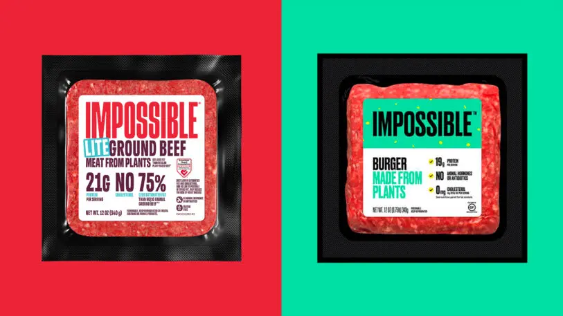
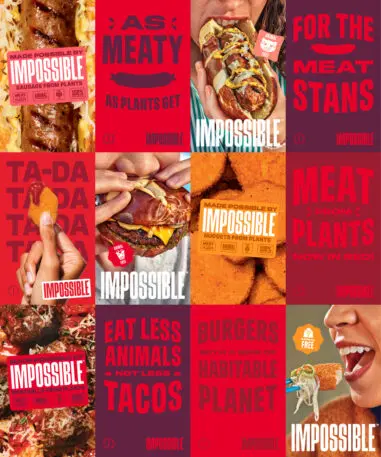
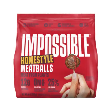
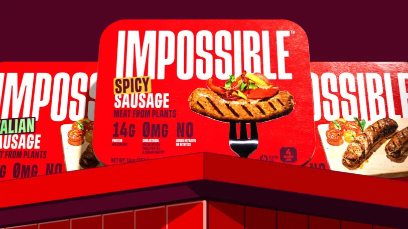
Most prominently, the system has transitioned from a series of pastels grounded in a seafoam green on packaging—which McGuinness says “looked like legacy greenwashing”—to a full-out gradient play on red, a color system inspired by Impossible’s use of heme in its proteins, and the rare, medium, and well-done cook of a burger.
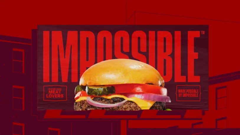
The color red is hard to ignore, and it’s particularly alluring in food (even though research is still debating if it suppresses appetites or whets them). Most fast food brands deploy the color in their logo—McDonald’s, Burger King, Wendy’s, Sonic, Chick-Fil-A, Papa John’s, Chipotle, KFC, Pizza Hut, Jack In the Box, Raising Cains, Arby’s, and Dairy Queen—to name a few.
“We are a red brand, we’re really, really doubling down on that, and it follows this meat-first approach,” says Lisa Smith, who is now Executive Creative Director at JKR. “It reflects a huge break from the plant based meat category…we want to debut ours in the meat aisle.” But whether Impossible actually appears in the meat aisle or not, red is sure to pop off the shelf, where most plant brands eschew the color. Meanwhile, greens and blues will play into the brand only sparingly, as a “wink,” particularly on digital.
“When you know about Impossible and want to know about all of the environtally benefits you still do need a touch of blue and green,” says Smith. “So it’s not entirely lost.”
As for the rest of the system, the wordmark maintains its all-caps vertical stretch, but by flipping the second “S” in Impossible, JKR has squeezed a fork into the negative space that will be key in animated elements for the brand.
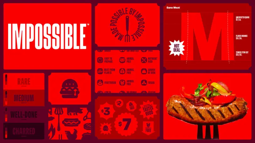
The system also introduces a new custom typeface that’s called *adorable alert* “Sans Meat.” Inspired by the thick hand painted appliqués on grocery stores and butcher shops, it creates a subliminal link to America’s fuzzy feelings about meat. The brand system’s violators—those little stickery bursts on packaging that call your attention to big nutrition claims—were pulled from stickers on styrofoam meat packs. Then as a finishing touch, cute woodcuts of chickens, cows, and pigs will don the packages, too, sans guilt.
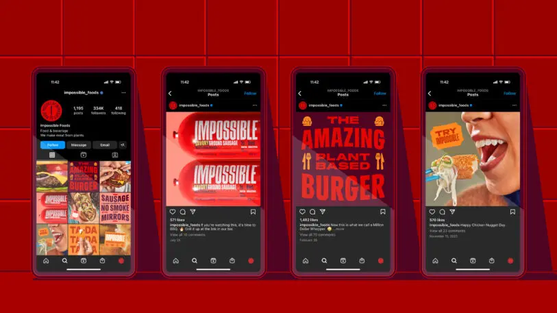
Finally, the new brand will be grounded in updated photography. While Impossible’s previous approach featured burgers and sausages photographed with an almost clinical detachment—a legacy of Impossible’s techie startup roots—the new food gets up close and personal (reminiscent of Smith’s work on Burger King), with close-up, saturated imagery that sizzles in front of your eyes.
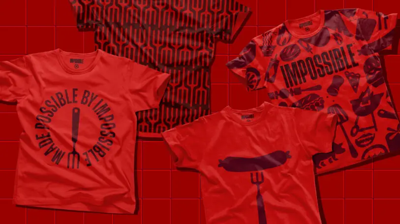
“It’s a straightforward approach, not gonna lie,” Smith laughs. “No question, the number one goal is to see how much it looks just like meat. In past lives we would have disguised it, making it look similar to plant based category. Here we put it front and center as the hero.”
Rumors have swirled for over a year that Impossible could go public like its counterpart Beyond Meat. But to woo the market, Impossible first needs to woo the public, and become a meaningful touchstone to the 94% of Americans who have yet to even try the product.
“A mistake we made is [assuming] that animal culture will be dead in two years. We’ve positioned this as black and white,” says McGuinness. Now? Impossible has opted for red.
ABOUT THE AUTHOR
Fast Company – co-design
(42)