This essay appears courtesy of Nightingale, the Journal of the Data Visualization Society.
There’s always something going on in the field of data visualization, but until recently it was only something that people in the field noticed. To the outside world, beyond perhaps an occasional Amazing Map®, Tufte workshop, or funny pie chart, these trends are invisible. Not so in 2019, where data visualization featured prominently in major news stories, and key players in the field created work that didn’t just do well on Dataviz Twitter but all over.

[Illustration: Surasti Puri]
2019 saw the United States president amend a data visualization product with a Sharpie. That should have been enough to make 2019 special, but the year also saw the introduction of a data visualization-focused fashion line, a touching book that uses data visualization to express some of the anxieties and feelings we all struggle with, as well as the creation of the first holistic professional society focused on data visualization.

[Illustration: Surasti Puri]
The first data visualization president
When Donald Trump was elected, he framed and hung in the White House a map of the United States that implied he was elected by an enormous landslide. But as every frustrated data visualization expert pointed out, this map neglected to indicate that more people didn’t vote for Trump than did.
The United States has had data-driven presidents before—Thomas Jefferson famously charted the crops the slaves of his plantation planted every year. But the United States has never had a president that cared more about the appearance of data than the data itself, until now.
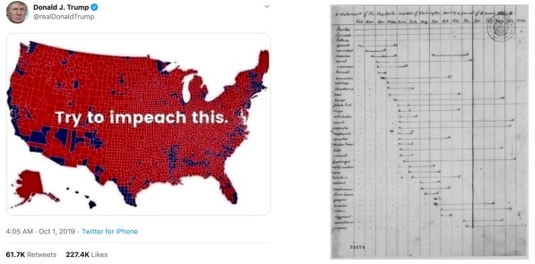
[Images: courtesy of the author]
The critical thing to recognize is that it was the rhetorical value of the above geospatial data visualization and not its underlying dataset that was important to Trump. But it wasn’t the electoral map that cemented Donald Trump’s status as the first data visualization president because, critically, the map was representing the data (it was just doing so in a way that was misleading). It was this year in September when, confronted with an official map of the range of the effects of Hurricane Dorian—one that contradicted his claims about what states might be affected—he decided to draw onto the map an additional bit of range. The data didn’t support it, and wasn’t even uncertain enough to allow it to be drawn with digital tools, but Trump knew if he could just change the visualization, that was all that mattered.
This has been taken by many pundits as a sign that we live in a post-fact era, but that’s shortsighted. Instead, public debates about the presentation of data increase the prominence of data visualization as a meaningful act. The previous way of looking at it, that you were just “showing the data” is naive and misleading and leads to products like Trump’s “Impeach This” map. The naive perspective that data visualization is just a final step to help people see the data ignores the importance of subtle steps such as showing uncertainty as well as the necessity to design a product that engages the audience (something Trump does far better than many data visualization practitioners).
Trump is a sign of this, not a cause, and as we move forward in our practice we need to be more aware of how, for many people, the visualization is the data.

[Illustration: Surasti Puri]
Reflective data visualization
Just as there have been presidents before Trump who have shown charts, there have been books before Michelle Rial’s Am I Overthinking This? that were filled with charts. But Rial’s book, unlike the typical data visualization coffee table book, is not a collection of charts selected for their historical or design merits. Instead, she has created a series of charts by hand in her inimitable style that highlights the contradictions, fears, and complexities of modern life in a way that text simply can’t.
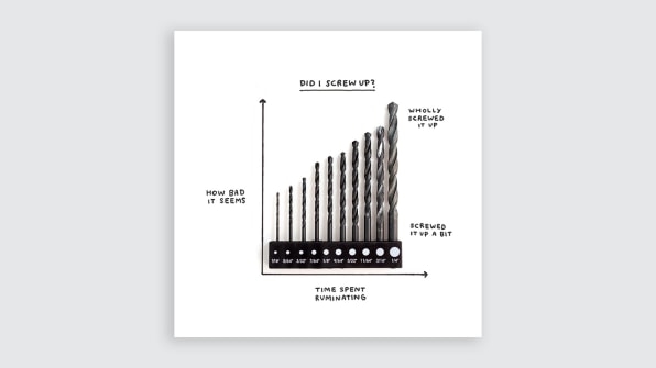
[Image: Michelle Rial/courtesy of the author]
Data visualization as a way of exploring and expressing one’s feelings and traits has always been present in the margins of the field. Data-driven badges are always popular, and Dear Data provided a nice model for thinking about one’s life and connecting with each other in a systematic way. Likewise, XKCD has often produced data visualization content. The internet is littered with jokes like the pie chart made of a real pie, which have always proved popular with audiences. But Rial’s book signals a fundamental shift toward the act of creating data visualization as a standalone way of imputing meaning, not as a gimmick or a one-off but fully engaged as the primary method for dealing with an increasingly data-intruded life.
That’s probably why Rial’s work is constantly shared without credit.

[Illustration: Surasti Puri]
The unstoppable Giorgia Lupi
Our profession suffers from an implicit stratification that bubbles up into a disdain for those who use one method of doing data visualization over the other. Practitioners who use one tool think those who use another aren’t as good. Coders think people who rely on tools are less capable. People who write in one language or with one library think the others are worse. As a result, we see an overemphasis on learning technical skills over design.
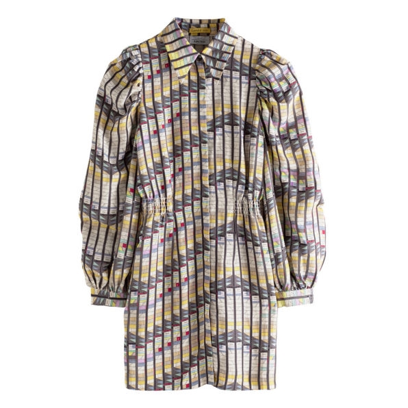
Except for Giorgia Lupi, who has throughout her career eschewed this entire line of reasoning to forge a path that touches on traditional data visualization, data art, design, and data humanism. This year, Lupi has tacked on two more significant achievements: She has started a fashion line and joined Pentagram, the world’s largest independent design consultancy.
As with the earlier themes, there have been examples of data visualization in fashion before this, most notably Rachel Binx‘s continuing work to create jewelry and clothing based on data visualization. But it wasn’t until Lupi’s efforts that this sort of thing began to be covered by mainstream media such as Vogue.
Looker and Tableau purchases
In 2019, Salesforce purchased the analytics platform Tableau for $15 billion, and Google purchased Looker, another analytics platform, for nearly $3 billion. These are serious investments and are likely not the last of their kind. Both Salesforce and Google have already invested significantly in their own in-house data visualization tools, but both realized that to compete they needed to rapidly expand their data visualization capacities and were willing to pay top dollar to do so.
Data is increasingly important to all businesses, not just tech, and so much a part of our everyday lives that it makes sense that companies with strong data analysis, data science, and data engineering talent would feel the need to improve their data visualization capabilities. When data visualization is considered just a skill, it’s usually less important than the modeling, ETL design, and analysis for the professionals. But we’re now seeing an acknowledgment that if you don’t have good data visualization then your insights are less apparent, resonate less with audiences, and are harder to communicate among scientists.
The Data Visualization Society
As its executive director, I recognize my bias, but the growth of the Data Visualization Society in 2019 clearly indicates a pent-up desire to bring together the profession and field in a holistic way. What was just an idea of three people back in February has grown to a 10,000-member organization with regular debates about important topics, an annual community survey, data visualization challenges, a thriving publication, social media influence, and a growing slate of resources. Speaking from inside the process, I can say that it has been an enormous amount of fulfilling work.

[Illustration: Surasti Puri]
Looking forward
Data visualization is technically mature. The rise of new tools and technologies is less based on features around the core area of displaying graphics encoded with data attributes and more around improved UI/UX and, increasingly often, machine learning-based approaches to improve suggestions for which chart to use. As practitioners, this lets us shift our focus away from technical problems toward longstanding themes of underdevelopment of design and information modeling.
Data visualization is becoming less of a tech company rarity and more a part of everyone’s everyday life. If you have a smartwatch, you see data visualization encoding your exercise routine and other details of your everyday life. And not just there; data visualization is all over, in sleep tracking apps, weather reports that encode uncertainty, communications pieces such as Spotify’s end-of-the-year report, goal tracking apps, bullet journal habit tracking, diet/food tracking apps such as MyFitnessPal, bank statements, and more. It will only continue to grow more common in the coming years.
Data visualization is also its own standalone endeavor with more and more professional roles and whole organizations dedicated to it.
What we need to do next year is reexamine all our preconceived notions about what makes data visualization good and how to achieve it. We need to seriously rethink what we’re doing, because what we’re doing has seriously changed. Modern data visualization is optimized for producing charts for busy executives. But that’s changing. Now, data visualization is personal stories, small businesses, data science, political campaigns, human resources, community building—in short, data visualization is becoming a part of the fabric that is modern culture. We need to throw away our old notions of data visualization and understand how this new data visualization is made, how it’s read, and how it relates to itself.
Elijah Meeks is the executive director of the Data Visualization Society and a data visualization engineer at Apple. He’s the author of D3.js in Action and the creator of Semiotic, a React-based charting framework, as well as the Data Explorer found in the nteract notebook platform. He’s created data visualization products in academia and industry, including a stint at Netflix and also creating digital humanities works at Stanford. This article was adapted with permission. Read the original here.
Fast Company , Read Full Story
(98)