The most hated data visualization in politics is back to spike your blood pressure
I believed in the power of data visualization to turn esoteric numbers and vague polls and probabilities into easily digestible information. And then Trump was elected in 2016 in a sheer blindsiding of any informed reader who followed a major news outlet with a powerhouse political graphics department. The charts had made it look like a landslide for Clinton. But Trump easily won.
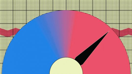
Nearly four years later, “The Upshot,” the data-centric section of the New York Times, is bringing back the most reviled graphic of the 2016 election: the needle.
On Election Night 2016, the needle displayed results like a gas gauge. But unlike a gas gauge, which is designed to convey at-a-glance information, not wild vagaries, the needle bounced up and down between candidates as more data came in. It left the viewer constantly on alert, an effect promoted by an extra quivering animation that was added to the needle itself. That was meant to convey margin of error, supposedly, but in fact, it created a nerve-wracking uncertainty, like a bomb was about to explode. The design was so fraught, two contributors to “The Upshot” penned separate defenses.

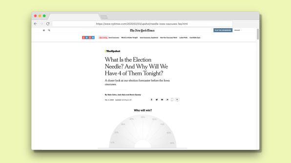
Today, “The Upshot” announced plans to resurrect the needle for Iowa caucus results—and not just one needle, but four separate needles. The site presented the needle’s return in a 1,500-word FAQ that fails to address the previous criticisms of the needle, and instead explains why the NYT is keeping it: Basically, the needle is, to their writers and graphics experts, an elegant way to mix various pieces of data into one updatable result. Or rather . . . four.
Why four? The Democratic Party is sharing more data about the caucus results than it has in previous years, and the NYT will also pass along that additional data.
The first needle will determine whom we widely consider the winner—the candidate who lands the most state delegate equivalents. The other three needles depict data from other steps of the caucuses: How a candidate is viewed upon arrival, how a candidate is viewed after nonviable candidates are ditched, and the pledged delegate count itself. (My head is spinning too. But the New York Times explains that, technically, a different candidate could “win” each of these needles. Which is apparently why there are four.)
The needles will no longer jitter , but it appears “The Upshot” has made one adjustment since 2016. “This year, the needle will also describe probabilities with a simple phrase; it would describe the odds of someone with a 65 percent chance of winning as ‘likelier than not,’” the FAQ explains. The designers are trying to counter numbers with plain language. That’s fine when things are near 50/50. But keep in mind that in 2016, the NYT data analysis pumped Hillary’s probability of winning to 85 percent, which takes a massive amount of mental discipline to remember will be a loss for her every 1.5 out of 10 times. (It’s why in 2016, “The Upshot” actually apologized for its approach to the election.) Besides, if people actually read through and truly grasped statistical arguments, then they wouldn’t be staring at these graphics in the first place.
(12)


